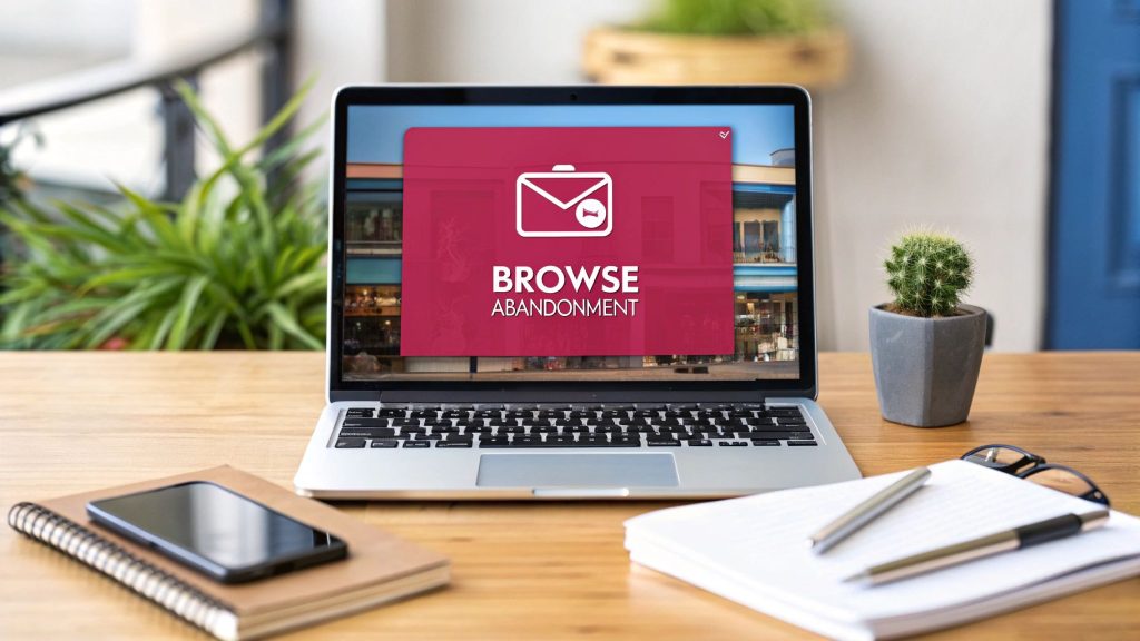
A browse abandonment email is a targeted, automated message sent to a shopper who viewed products on your site but left without adding anything to their cart. Think of it as a friendly follow-up for online window shoppers, designed to pull them back in before they forget about your brand entirely.
The Hidden Cost of Online Window Shopping
Every e-commerce store owner knows the sting of cart abandonment. It’s the digital version of a customer filling a shopping cart, walking it all the way to the checkout line, and then just leaving it there. It’s a loss you can see and measure.
But what about the much, much larger group of visitors who never even get that far? These are your online window shoppers, and they represent a massive, often overlooked pool of potential revenue. They’re interested—clicking through categories, looking at specific products, and spending time on your site—but they leave before ever deciding to add something to their cart. This is browse abandonment, and it’s a completely different challenge.
The True Opportunity Beyond the Cart
To really get the difference, let’s use a simple store analogy.
- Cart abandonment is like a shopper putting an item on the checkout counter and then walking away. Their intent to buy is high.
- Browse abandonment is like a shopper walking into your store, picking up an item, looking it over, and then putting it back on the shelf before leaving. Their interest is obvious, but their commitment isn’t quite there yet.
If you ignore this second group, you’re waiting for shoppers to be almost certain they want to buy before you even start talking to them. A smart browse abandonment email strategy lets you engage these browsers while your brand and products are still fresh in their minds. It’s a gentle nudge, not a hard sell.
By reaching out to these potential customers, you’re proactively recovering interest that would otherwise just disappear. It’s a foundational part of modern e-commerce marketing that turns passive looking into active engagement.
This isn’t just a nice-to-have tactic; it’s a core strategy for capturing sales you would otherwise lose. The data backs this up, showing that browse abandonment emails have a conversion rate of around 0.96%. That might not sound like a lot, but it’s a huge leap from the typical 0.10% conversion rate of general email campaigns. That makes it an incredibly powerful tool for revenue recovery. You can learn more about the power of browse abandonment emails from the experts at Klaviyo.
Engaging these “just looking” visitors turns a passive website visit into a real sales opportunity. You’re building a bridge to customers who have shown genuine—albeit early—interest in what you’re selling.
Defining Your Browse Abandonment Email Approach
So, what exactly is a browse abandonment email?
Think of it as a strategic tap on the shoulder. It’s a follow-up email sent to a known visitor who browsed specific products or categories on your site but left without adding anything to their cart. It’s the digital version of a helpful store employee noticing your interest and asking, “Can I help you find something?”—not a pushy, in-your-face sales pitch.
These emails work because they tap directly into the psychology of the moment, specifically recency bias. Your brand and the products they were just looking at are still fresh in their mind. A timely, personalized reminder can be all it takes to reignite that initial spark of interest before it disappears for good.
The Right Message For The Right Moment
It’s so important to understand that a browse abandonment email is a completely different beast from its more famous cousin, the cart abandonment email. While both are designed to win back sales, they target shoppers at totally different points in their journey. This means they need a different approach when it comes to timing, tone, and what you offer. Nailing this distinction is everything.
A great way to think about it is this: a cart abandoner is standing at the finish line and just needs a little nudge to cross it. A browse abandoner is still jogging around the track, exploring, and needs some encouragement to stay in the race. Your message has to reflect that difference in intent.
Just look at how small tweaks in your strategy can lead to some seriously impressive boosts in both open rates and conversions.
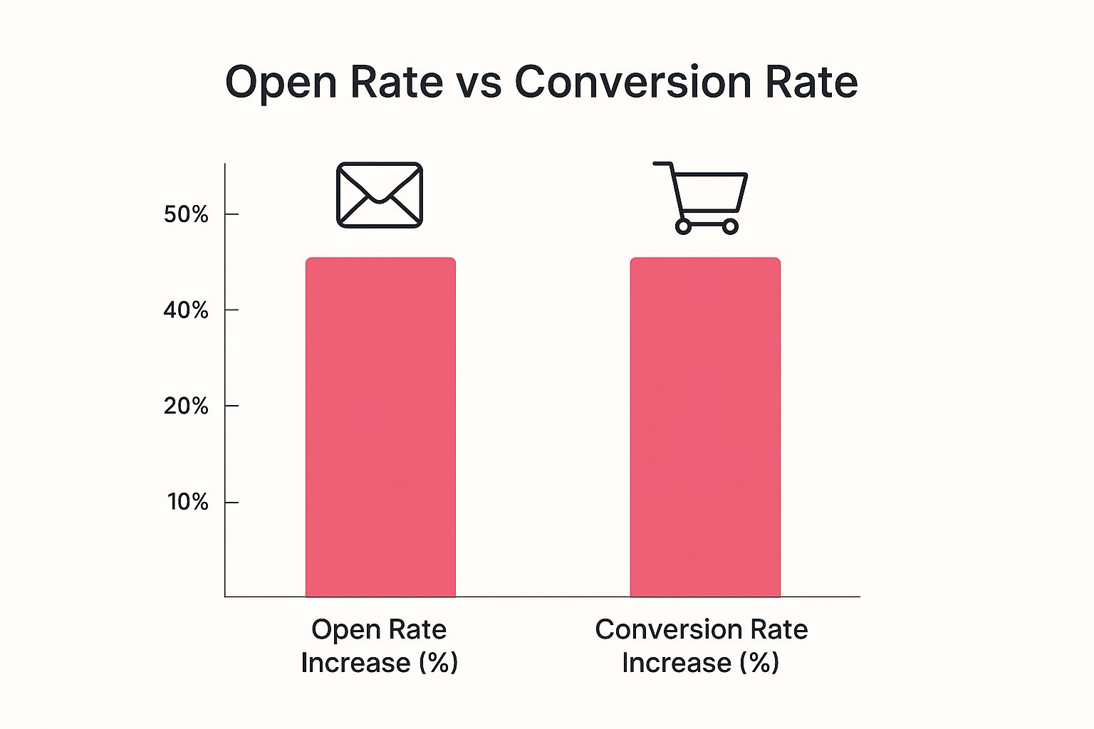
The data doesn’t lie. Focusing on these tailored interactions pays off, proving that a smart, well-defined approach is more than worth the effort.
Distinguishing Browse From Cart Abandonment
If you don’t separate these two scenarios, you risk creating a clunky, confusing experience for your customers and leaving money on the table. Let’s quickly compare the two so you can see just how different they are.
Browse Abandonment vs Cart Abandonment A Quick Comparison
Here’s a side-by-side look at the key differences between these two types of abandonment emails. Understanding these attributes will help you craft the perfect message for each situation.
| Attribute | Browse Abandonment Email | Cart Abandonment Email |
|---|---|---|
| Trigger | User views product/category pages and leaves the site. | User adds item(s) to the cart and leaves without buying. |
| User Intent | Lower; user is in the “discovery” or “consideration” phase. | Higher; user has shown a clear intent to purchase specific items. |
| Timing | Sooner; typically sent within 1-2 hours post-browse. | Later; often sent 1-4 hours after cart is abandoned. |
| Content Focus | Helpful reminders, product discovery, and social proof. | Urgency, overcoming objections, and securing the sale. |
| Call-to-Action | Softer CTAs like “Take Another Look” or “Still Interested?” | Direct CTAs like “Complete Your Order” or “Return to Your Cart.” |
As you can see, the goals are distinct. The browse abandonment email is all about gentle nudges and re-engagement, while the cart abandonment email is focused on closing the deal.
At its heart, a browse abandonment email is a form of retargeting, a marketing strategy focused on bringing back users who have already interacted with your brand. Getting a handle on the broader concept of What Is Retargeting? will give you a solid foundation for your entire strategy.
By mastering this distinction, you can tailor your messaging with surgical precision. The goal of a browse abandonment email isn’t always an immediate sale. It’s about building the relationship and guiding the shopper back into your sales funnel. For a deeper dive into setting up these campaigns, check out our strategic playbook for browse abandonment emails to really maximize your recovery efforts. This turns your emails into a key tool for nurturing interest right when it matters most.
Crafting Your High-Converting Browse Abandonment Email

Alright, let’s move from theory to action. Knowing what a browse abandonment email is is one thing, but building one that actually works is where the magic happens. A poorly designed email feels intrusive and generic—a quick trip to the trash folder. But a great one? It’s like a helpful store associate tapping them on the shoulder, guiding them back to something they genuinely liked.
The secret is to get inside the shopper’s head. They showed interest but, for whatever reason, weren’t ready to pull the trigger. Your email shouldn’t be a pushy sales pitch. Instead, it should gently rekindle their curiosity and make it incredibly easy to pick up right where they left off.
Writing Subject Lines That Intrigue, Not Intrude
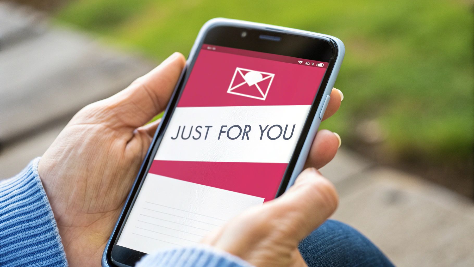
Your subject line is your first impression—and maybe your only shot at getting a click. A good browse abandonment subject line has to walk a fine line between being personal and just plain creepy. The goal is to spark a flicker of recognition without making someone feel like you’ve been watching their every move.
Personalizing it by referencing the category they looked at can work wonders. You want to come across as helpful and relevant, not Big Brother.
Here are a few angles to test out:
- The Gentle Reminder: “Still thinking it over?” or “Did something catch your eye?”
- The Product-Specific Nudge: “The [Product Name] is waiting for you.”
- The Flattering Approach: “You’ve got great taste!” or “We noticed your excellent choice.”
Honestly, the best ones are often short, engaging, and feel like they’re coming from a brand that’s actually paying attention.
Showcasing The Products They Viewed
This is the heart of your email. You need to remind them of what they were looking at. This is where dynamic content becomes your best friend. Instead of a generic “come on back” message, your email should automatically pull in high-quality images of the exact products they viewed.
Seeing the item again triggers an instant visual recall. It brings back that specific design, color, or feature that grabbed their attention in the first place. This isn’t just another marketing blast; it’s a personalized, “Hey, remember this specific thing you liked?” nudge.
By featuring the exact item, you transform a general marketing email into a personal shopping assistant. It reinforces their initial interest and bridges the gap between browsing and buying.
This is the kind of personalization that separates an email that gets deleted from one that gets a click. It shows you were listening.
Crafting Copy That Reminds and Persuades
Keep your copy light, friendly, and helpful. Seriously, drop the aggressive sales language. The goal here is re-engagement, not a hard sell. Your tone should be conversational, almost like a helpful clerk from their favorite shop reaching out.
Simple phrases usually work best:
- “We noticed you checking this out…”
- “Take another look?”
- “In case you were still interested…”
This kind of language is low-pressure. It respects that the shopper is still just thinking things over. The copy is there to support the product images, gently guiding their attention back to the items without creating friction.
Building Trust With Social Proof
One of the best ways to get someone off the fence is with a little social proof. A shopper might be hesitant, wondering about quality, fit, or if the product is really worth it. Dropping customer reviews and star ratings right into the email can give them the nudge they need.
Seeing that other people bought and loved the item builds a ton of trust. A little snippet of a 5-star review like, “This is the best jacket I’ve ever owned!” can be way more powerful than anything your marketing team could write.
This works because it answers the unspoken questions every browser has: Is this product any good? Do other people actually like it? Answering those questions builds confidence and lowers the perceived risk of making a purchase.
Creating A Low-Friction Call-To-Action
Finally, your call-to-action (CTA) has to match the user’s mindset. A big, loud “Buy Now!” button can feel jarring. They haven’t even added the item to their cart, and you’re already asking for their credit card? It creates a major disconnect.
Instead, go for softer, lower-friction CTAs that simply invite them to continue their journey.
- Take Another Look
- View The Item
- Continue Shopping
- See The Details
These feel more natural and less demanding. They just encourage the user to come back and explore, making the click feel like a small, easy next step instead of a huge commitment. The whole experience should feel seamless, guiding them smoothly back to your product page to rediscover what caught their eye.
Winning Browse Abandonment Email Examples And Templates
Theory is one thing, but seeing a high-performing browse abandonment email in the wild is where the real learning happens. When we look at what top brands are doing right, we can pull apart their success and use those same ingredients in our own strategies. The best examples strike a perfect balance between personalization, brand voice, and a clear call-to-action—all without coming off as pushy.
Take this email from Adidas. It’s a masterclass in the fundamentals.
This email just works. It’s clean, direct, and genuinely helpful. The simple question, “IS IT STILL ON YOUR MIND?” feels personal and completely low-pressure. Paired with a high-quality product image, it’s an instant visual reminder of what caught the shopper’s attention in the first place.
Ready-To-Use Browse Abandonment Email Templates
You don’t need to start from a blank page. These three templates are designed to tackle the most effective angles for re-engaging those “just looking” visitors. Just tweak the copy to match your brand’s unique voice.
1. The Gentle Reminder Template
This first email is your initial, soft-touch follow-up. The goal is simple: gently remind them of the product they liked and make it incredibly easy to get back to it. Send this one out within 1-2 hours of their visit.
- Subject: Still thinking it over?
- Body:
Hey [Customer Name],We noticed you were checking out some great gear. Your taste is excellent!
Life gets busy, so we went ahead and saved the items for you.
[Dynamic Product Block: Image of Viewed Product]Ready to take another look? Just click the button below to pick up right where you left off.
[CTA Button: See It Again]
2. The Social Proof Booster Template
If the first reminder didn’t get a click, it’s time to build a little more confidence. This email, sent about 24 hours later, brings customer reviews into the picture. Sometimes, a little social proof is the final push a hesitant shopper needs to feel good about their choice.
- Subject: Others are loving the [Product Category]!
- Body:
Hi [Customer Name],It looks like the [Product Name] caught your eye! It’s actually one of our most popular items, and customers have had great things to say about it.
[Dynamic Product Block: Image of Viewed Product]Here’s what people are saying:
“This is the best [product type] I’ve ever owned. The quality is amazing and it was worth every penny!” – [Reviewer Name]
Don’t just take our word for it. See why everyone is raving about it.
[CTA Button: View Product & Reviews]
3. The Helpful Incentive Template
For shoppers who are still on the fence after two emails, a small, strategic incentive can be the final nudge they need. Sent 2-3 days after they browsed, this email gives them a compelling reason to buy now, like free shipping or a small discount. Just be careful with this one—you don’t want to train customers to wait for a deal every time.
- Subject: A little something to help you decide…
- Body:
Hey [Customer Name],Still deciding on the [Product Name]? We’d love for you to give it a try.
[Dynamic Product Block: Image of Viewed Product]To make the decision a little easier, we’d like to offer you free shipping on your entire order.
Complete your purchase today and let us handle the delivery cost.
[CTA Button: Claim My Free Shipping]
Pairing these email strategies with other channels like SMS can be a game-changer. If you’re looking for more ways to re-engage customers, you might find our guide on proven SMS message examples that drive results really useful. Integrating different touchpoints creates a much more powerful and effective recovery strategy.
Optimizing Your Browse Abandonment Email Strategy

Sending out a single, well-written browse abandonment email is a great start. But if you really want to see this tactic shine, you need to think bigger. True success doesn’t come from one message, but from a smart, data-driven strategy that adapts to how different customers behave.
It’s about moving past one-off emails and building a full-blown sequence.
A solid strategy gets that not all window shoppers are created equal. A brand new visitor needs a totally different message than a loyal customer who’s bought from you a dozen times. A winning program accounts for these little differences, making sure every email feels personal and helpful, not generic or pushy.
Perfecting Your Timing And Sequence
Timing is everything. Send that first email too quickly, and you might annoy a shopper who was just about to come back on their own. Wait too long, and that initial spark of interest is gone for good.
From what we’ve seen, the sweet spot for the first browse abandonment email is about 1 to 2 hours after they’ve left your site. This gives them enough breathing room so your reminder feels like a welcome nudge, not a stalkerish alert.
But don’t just stop at one. A single email can easily get buried in a busy inbox. A multi-email sequence, or “flow,” seriously boosts your chances of re-engagement without driving people crazy.
Here’s a simple, effective sequence that works wonders:
- Email 1 (1-2 Hours Post-Browse): This is your gentle reminder. The goal is just to showcase the product they were looking at with a soft call-to-action like “Take Another Look.” Keep it simple.
- Email 2 (24 Hours Post-Browse): If they didn’t bite, it’s time to build some confidence. Add a little social proof like star ratings or a snippet from a customer review.
- Email 3 (2-3 Days Post-Browse): For anyone still on the fence, a small, helpful incentive like free shipping can be the final push they need to make a move.
This step-by-step approach respects the customer’s mindset, starting with a simple reminder and gradually building to a more compelling offer.
The Power Of Smart Segmentation
Now, here’s the real secret sauce: smart segmentation. Blasting the same message to every single browser is a huge missed opportunity. You need to slice your audience into logical groups and tailor the message for each one.
Think about creating segments like these:
- First-Time Visitors vs. Loyal Customers: Welcome newcomers with a friendly hello and maybe a small first-timer discount. For your regulars, acknowledge their loyalty and you could even suggest items related to their past purchases.
- High-Value Browsers: Did someone check out your most expensive items or spend a ton of time on a single page? These folks have high intent. They might deserve a more personalized email or a slightly better offer.
- Category-Specific Browsers: If a user only browsed “running shoes,” don’t send them emails about hiking boots. Keep the follow-up content focused on running gear, maybe even linking to a helpful guide on finding the right shoe.
By segmenting your audience, you transform your browse abandonment emails from a generic broadcast into a series of personal, relevant conversations. This is what separates a good strategy from a great one.
If you want to go deeper into turning more site visitors into actual customers, understanding website conversion optimization is a great place to start. It helps put into perspective why these small email tweaks can lead to such big results.
A/B Testing Your Way To Success
A browse abandonment strategy should never be a “set it and forget it” kind of deal. The best brands are constantly tweaking and refining their approach based on real data. A/B testing is your best friend here.
You should always be testing different parts of your emails to see what your audience responds to:
- Subject Lines: Try a question (“Still thinking it over?”) against a statement (“You’ve got great taste!”).
- Send Times: Does an email sent at 1 hour get more clicks than one sent at 2 hours? Test it!
- Offers: Does free shipping outperform a 10% discount? The answer might surprise you.
- Calls-to-Action: Compare “View Item” against “Take Another Look” to see which one drives more traffic back to your site.
This continuous cycle of testing, learning, and improving is what drives real, long-term ROI and keeps your emails from getting stale. It’s a critical piece of the puzzle, especially when you consider the larger problem of site abandonment. It’s a massive challenge—after all, roughly 70% of shopping carts are abandoned, which translates to an estimated $18 billion in lost sales every year.
For a more complete look at tackling this problem, check out our guide on proven strategies to reduce cart abandonment.
Setting Up Your Automated Browse Abandonment Workflow
Getting a browse abandonment email strategy up and running might seem complicated, but modern marketing tools have made it surprisingly simple. You don’t need to be a tech genius; it’s really all about understanding a few logical steps.
The entire system relies on a single, crucial element: a website tracking snippet.
This tiny piece of code, which you get from your email service provider, is the real brains behind the operation. Once you install it on your site, it acts like a digital doorman. It recognizes known users (like your email subscribers) and keeps an eye on what they do—specifically, which products they look at. This is what lets you send out those hyper-relevant “were you still looking?” emails.
Building The Automation Logic
With the tracking snippet in place, you can start building the actual workflow in your email platform. This is where you lay out the rules, telling the system exactly what to do and when. Think of it as creating a simple “if this, then that” recipe for your marketing.
The core pieces of any browse abandonment workflow are:
- The Trigger: This is the event that kicks everything off. For browse abandonment, the trigger is almost always “Viewed Product.” When a known user clicks on a product page but doesn’t add it to their cart or buy it, the trigger fires.
- The Time Delay: You definitely don’t want to blast an email the second someone leaves a page. That’s just creepy. A strategic time delay, usually 1 to 2 hours, makes the follow-up feel like a helpful nudge instead of a Big Brother alert.
- The Email Sequence: This is the actual email or series of emails you’ll send. You can keep it simple with a single email or build a more complex flow that sends a few different messages over several days.
A Critical Step: Workflow Filters
One of the most important parts of this setup is telling your system when not to send an email. You have to add filters to make sure you aren’t messaging people who eventually took the next step on their own.
A smart workflow is defined as much by the emails it doesn’t send as by the ones it does. Excluding shoppers who convert is essential for a good customer experience and keeps your messages relevant.
Your automation logic must include rules to stop the sequence for anyone who:
- Adds an item to their cart: This person has moved past the browsing stage. They should now be in your cart abandonment flow, which needs a completely different type of message. For more on that, our guide on how to recover abandoned carts goes into much more detail.
- Completes a purchase: Sending a “Still interested?” email to someone who just bought the item is a classic marketing fumble. Your workflow needs a filter to check for purchase activity and pull the user out of the sequence immediately if they buy.
By setting up these triggers, delays, and—most importantly—exclusion filters, you create a powerful, automated system. It works quietly in the background, re-engaging interested shoppers and turning what would have been missed opportunities into sales, all without you lifting a finger.
Common Questions About Browse Abandonment Emails
As you start putting your browse abandonment strategy together, a few key questions always seem to pop up. Getting these right is the difference between a helpful nudge and an annoying intrusion—and it’s what ultimately drives real results.
How Many Emails Should I Send?
This is a classic balancing act. You want to stay on their radar without becoming a nuisance. From what we’ve seen, a sequence of two to three emails usually hits the mark.
- Email 1 (1-2 Hours Post-Browse): Think of this as a gentle, no-pressure “Hey, you left this behind.”
- Email 2 (24 Hours Later): Time to follow up. This is a great spot to add some social proof or show them a few related products they might also love.
- Email 3 (2-3 Days Later): This is your final nudge. If you’re going to offer a small incentive, now’s the time.
This timing keeps your brand fresh in their mind without clogging up their inbox.
Is Offering A Discount Always A Good Idea?
No, and this is a common trap. While a discount can definitely push a sale over the finish line, dangling one too early is a quick way to teach your customers to just wait for a deal. It’s much smarter to save incentives for the last email in your sequence or for specific high-value shoppers.
Think of discounts as your closing argument, not your opening line. Use them strategically to convert those who are on the fence, rather than giving them away to everyone who just browses.
How Do I Avoid Being Creepy?
It all comes down to your tone and timing. Your messages should always feel like a helpful shop assistant popping over, not like you’ve been spying on them. Friendly, low-pressure language is your best friend here. Try phrases like “Still deciding?” or “We noticed you had great taste.”
Stay away from aggressive calls to action like “Buy Now!” in that first email. Instead, go for a softer invitation like “Take Another Look.” This small shift in wording makes a massive difference in how your email lands. Getting this right is crucial, and it’s a key part of the broader recovery strategies highlighted in various abandoned cart recovery statistics.
Ready to turn those window shoppers into paying customers? CartBoss makes it easy with automated SMS campaigns that re-engage visitors and recover lost sales on autopilot. Stop leaving money on the table and see how our powerful SMS tool can boost your revenue. Start converting more visitors today with CartBoss.