
Checkout Optimization: Your Path to Higher Sales
In today’s competitive e-commerce environment, your checkout process is more than just the final step. It’s a crucial element for driving revenue growth. Think back to complicated multi-page checkouts, hidden fees, and limited payment options. These friction points, once commonplace, now represent lost potential in a world where customers expect seamless and transparent online experiences.
The evolution of online shopping, driven by mobile commerce and increasing customer expectations, has transformed the checkout process. It’s no longer a simple transaction, but a critical touchpoint in the customer journey. A poorly designed checkout experience can lead to high cart abandonment rates, wasted marketing efforts, and ultimately, lost revenue.
On the other hand, an effective checkout process, built on the principles of user experience (UX) and conversion rate optimization (CRO), can significantly boost your bottom line. This is achieved by minimizing friction and maximizing conversions. It’s not just about getting customers to the checkout; it’s about getting them through it smoothly and efficiently.
From simplifying form fields to establishing trust and providing flexible payment options, optimizing your checkout can dramatically impact sales performance. We’ll explore eight best practices that address key factors influencing checkout conversion rates, helping you transform your checkout from a potential bottleneck into a sales powerhouse.
Streamlining the Checkout for Increased Conversions
Whether you use Shopify or WooCommerce, or manage multiple e-commerce clients, these insights will help you create a positive checkout experience. One that not only delights customers and reduces abandonment, but ultimately, drives higher sales and strengthens your brand. Focusing on a smooth, user-friendly checkout process is a key factor in converting potential customers into paying customers, and directly impacts your bottom line.
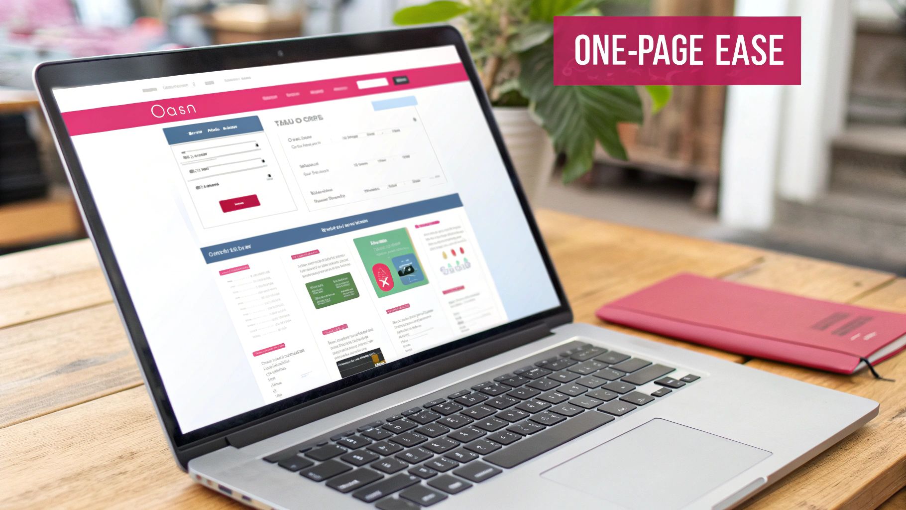
1. Streamlined One-Page Checkout
In the fast-paced world of online retail, every second counts. Lengthy checkout processes are a leading cause of cart abandonment. That’s why a streamlined one-page checkout is a crucial best practice for any ecommerce business. This approach combines all checkout steps – shipping, billing, and payment – onto a single page, significantly reducing the clicks and page loads needed to complete a purchase. This simplified flow minimizes friction and creates a more efficient path to conversion.
Key features of a well-designed one-page checkout include:
- All checkout fields displayed on one page
- Progressive disclosure to reveal information only when needed
- Real-time field validation for immediate feedback
- Collapsible sections (like accordions) for better organization
The benefits are clear: fewer clicks, decreased page load times, and a clear overview of all required information. Customers appreciate the transparency and speed, leading to higher conversion rates, often by 20-30%. This streamlined approach also reduces “multi-step fatigue,” a common reason for abandoned carts.
Examples of Effective One-Page Checkouts
Pioneered by companies like Amazon, the one-page checkout has become an industry standard. Shopify Plus and BigCommerce merchants are increasingly adopting this approach. Amazon’s streamlined checkout is a prime example, alongside ASOS’s responsive single-page checkout. Bellroy demonstrates the power of a clean, minimalist single-page layout.
Potential Drawbacks and Mitigation Strategies
However, a poorly designed one-page checkout can feel overwhelming, especially for new customers. Creating a responsive design that works across all devices can also be a challenge. The volume of information presented at once can create a higher cognitive load, potentially leading to confusion.
To address these challenges, consider these tips:
- Logical Grouping: Organize fields into logical groups (e.g., Shipping Address, Billing Information, Payment Details).
- Accordion-Style Sections: Use expandable and collapsible sections to manage visual density.
- Clear Progress Indication: Provide clear visual cues of progress (e.g., a progress bar or highlighted sections).
- Responsive Design Testing: Thorough testing across various devices is essential.
- Hybrid Approach: For complex purchases, consider a hybrid approach with a minimal number of steps to balance brevity and clarity. For more on optimizing checkouts, see: Optimizing Your Checkout for Better Conversions.
By understanding the advantages and potential pitfalls, and implementing these tips, you can harness the one-page checkout to boost your conversion rates and reduce cart abandonment.
2. Guest Checkout Option
One of the most impactful changes you can make to your ecommerce checkout process is enabling a guest checkout option. Guest checkout allows customers to purchase without creating an account, removing a significant barrier to conversion. This prioritizes completing the transaction immediately rather than user registration, recognizing that forcing account creation deters many shoppers. While collecting customer data is valuable, requiring it upfront can mean lost sales. Guest checkout offers account creation as an optional post-purchase step, improving the user experience.
This approach simplifies information collection, often only needing an email address for identification and order updates. Features like pre-filled address fields and one-click payment options further enhance the speed and convenience. The benefits are numerous: reduced friction during checkout, a potential conversion rate increase of 45% or more, and broader appeal to first-time or occasional shoppers hesitant to create accounts. It also addresses privacy concerns for customers wary of sharing personal information.
Examples of Effective Guest Checkout
Real-world examples of effective guest checkout include:
- Target: Their prominent “Continue as Guest” option simplifies the buying process.
- Best Buy: Their checkout flow gives equal emphasis to guest and registered checkout.
- Wayfair: Their simplified guest process makes purchasing quick and easy.
These retailers understand catering to the customer’s desire for a quick and easy purchase experience.
The rise of guest checkout is partially thanks to pioneering companies like ASOS and Walmart, along with research from organizations like the Baymard Institute, a leading UX research organization. Their studies consistently show the negative impact of forced registration on conversions.
While guest checkout offers significant advantages, it’s essential to be aware of potential drawbacks. You might miss capturing valuable customer data upfront, impacting personalized marketing and loyalty programs. Repeat purchases may also be slightly less convenient for guest users. However, these are often outweighed by the increase in completed transactions.
Tips for Implementing Guest Checkout
- Visibility is Key: Make the guest checkout option clear and easy to find.
- Promote Account Creation (Subtly): Explain account benefits, such as order tracking and faster future checkouts, without making it mandatory.
- Post-Purchase Account Creation: Offer account creation after purchase using the information already provided.
- Store Guest Data: Even for guest transactions, store essential data to allow customers to easily create an account later and link their purchase history.
- Unique Identifier: Use the customer’s email address to connect guest purchases and facilitate later account creation.
You might be interested in: 5 Reasons Why Customers Abandon Their Carts to understand the importance of a streamlined checkout.
By implementing well-designed guest checkout, you can significantly reduce cart abandonment, increase conversions, and create a more positive shopping experience. This deserves a prominent place in any list of ecommerce checkout best practices.
3. Mobile-Optimized Checkout
With over 60% of e-commerce traffic coming from mobile devices, a mobile-optimized checkout is essential. Shopping on a smartphone or tablet differs significantly from a desktop experience. Mobile checkout prioritizes speed, ease of use, and seamless interactions designed for smaller screens and touch interfaces. Ignoring mobile optimization will impact your bottom line, leading to higher cart abandonment rates and lost revenue. This makes a mobile-optimized checkout a crucial e-commerce best practice.

A mobile-optimized checkout focuses on:
- Touch-optimized form fields and buttons: Large, finger-friendly buttons (at least 44×44 pixels) and form fields minimize errors and frustration.
- Simplified form design: Reduce the number of fields and steps required to complete a purchase. Request only essential information and pre-fill data whenever possible.
- Mobile wallet integration (Apple Pay and Google Pay): Allow customers to use their preferred mobile payment methods for a faster and more secure checkout.
- Responsive design: The checkout experience should adapt seamlessly to different screen sizes and orientations.
- Streamlined information collection: Minimize keyboard changes between fields and use device features like camera scanning for credit card details.
Pros:
- Caters to the majority of e-commerce traffic: Addresses the growing dominance of mobile shopping.
- Reduces friction: Simplifies the purchase journey, leading to fewer abandoned carts.
- Boosts mobile conversion rates: Makes it easier for customers to complete purchases on their smartphones.
- Enables impulse purchases: Allows customers to buy conveniently from anywhere.
- Leverages biometric authentication: Offers faster and more secure checkout using fingerprint or facial recognition.
Cons:
- Requires separate design considerations: Mobile checkout requires a distinct approach compared to desktop design.
- Ongoing optimization: Staying current with new devices, operating systems, and mobile wallet updates is crucial.
- Balancing simplicity and information: Finding the right balance between a streamlined checkout and collecting necessary information can be challenging.
- Technical complexity: Implementing mobile wallets and other advanced features can require technical expertise.
Real-World Examples
- Etsy: Known for its mobile-first approach, Etsy provides a seamless checkout experience optimized for touch and speed.
- Nike: Offers a streamlined mobile checkout with Apple Pay integration, allowing for quick and easy purchases.
- Sephora: Their mobile app features a simplified checkout with fewer fields and mobile wallet options.
The Rise of Mobile-Optimized Checkout
The shift toward mobile-optimized checkout is driven by the increasing popularity of smartphones and the rise of mobile commerce. Platforms like Shopify and the introduction of mobile wallets like Apple Pay and Google Pay have further accelerated this trend. Mobile-first retailers like ASOS have also played a key role in popularizing this approach.
Practical Tips for Implementation
- Use large, touch-friendly buttons (minimum 44x44px).
- Implement mobile-specific input types (tel, email, etc.).
- Minimize keyboard changes between fields.
- Leverage device capabilities like the camera for credit card scanning.
- Test thoroughly on various devices and screen sizes.
- Prioritize mobile wallet integration.
By implementing a mobile-optimized checkout, e-commerce businesses can significantly improve their conversion rates, reduce cart abandonment, and cater to the growing number of mobile shoppers. This results in increased revenue and a better overall customer experience.
4. Transparent Pricing & Shipping Costs

Unexpected costs are a major reason for shopping cart abandonment. Being upfront about pricing and shipping combats this issue. Displaying all costs associated with a purchase early on – even before checkout begins – builds trust and sets clear expectations. This leads to a smoother, more predictable buying experience. This transparency is a best practice because it directly addresses a key pain point for online shoppers, ultimately increasing conversions and customer satisfaction.
This transparent approach includes several key features: displaying all costs upfront, including a shipping calculator, calculating taxes in real-time, providing a clear breakdown of all fees, and offering various shipping options with estimated delivery times. By showcasing the complete cost from the start, retailers empower customers to make informed decisions, reducing the chance of unpleasant surprises at the final checkout stage.
Several brands have successfully implemented transparent pricing. Everlane built its brand around radical transparency, even providing a detailed breakdown of its production costs. Zappos has long been known for its free shipping, clearly advertising it throughout the site. Warby Parker displays all costs associated with its eyewear upfront, including shipping and taxes. These examples highlight the various ways businesses can use transparency to improve the customer experience.
The benefits are substantial: fewer abandoned carts due to unexpected costs, increased customer trust, and a greater sense of control over the purchase price. However, there are potential drawbacks. Highlighting shipping costs might deter some customers. Implementing this strategy also requires integration with tax and shipping calculation systems, potentially adding complexity to website design.
Practical Tips for Implementation
- Show shipping costs on product pages or in the mini-cart: Don’t make customers wait until the checkout page to see shipping costs.
- Offer shipping threshold incentives (“Free shipping on orders over $X”): This encourages larger orders and can offset the impact of visible shipping costs.
- Use geolocation to estimate taxes earlier in the process: Provide accurate tax estimates as early as possible.
- Provide multiple shipping options with clear delivery timeframes: Give customers choices and control over their shipping experience.
- Consider including shipping in the product price if feasible: This simplifies the pricing structure and can make products more appealing.
You might be interested in: How Shipping Costs Influence Cart Abandonment Rates.
As online retail matured and customer expectations rose, transparent pricing became increasingly important. Early adopters like Everlane and Zappos demonstrated its effectiveness. The rise of Amazon Prime, with its transparent and predictable shipping, further solidified its value. Today, transparent pricing isn’t just a nice-to-have; it’s a customer expectation.
5. Multiple Payment Options
Offering diverse payment methods isn’t a bonus anymore; it’s a must-have for thriving e-commerce. This approach tackles a primary reason for cart abandonment: customers not finding their preferred payment method. By catering to various preferences and regional payment norms, businesses significantly boost their chances of converting potential customers into paying ones. This is why offering multiple payment options is a key e-commerce checkout best practice.
This strategy hinges on understanding your target audience and their financial comfort levels. Look beyond the usual credit and debit cards. Think about integrating digital wallets like PayPal, Apple Pay, and Google Pay, which offer a smooth and secure checkout. Buy-now-pay-later (BNPL) services such as Klarna, Affirm, and Afterpay are gaining popularity, especially with younger shoppers, by enabling installment payments. Consider ACH/bank transfers where appropriate. And for international customers, localized payment methods are essential. Even cryptocurrency can attract a tech-savvy clientele. These features help you connect with your customers on their financial terms.
Benefits and Drawbacks
Pros:
- Increased Conversion Rates: Offering preferred payments reduces checkout friction, boosting conversions.
- Expanded Customer Base: BNPL and other alternative payment methods welcome customers who may be unbanked or have limited credit.
- International Sales: Localized payments are vital for facilitating global sales.
- Reduced Friction: A seamless and familiar payment process minimizes cart abandonment.
- Increased Average Order Value: BNPL can empower customers to buy higher-priced items.
Cons:
- UI Complexity: Integrating many payment options can complicate checkout design.
- Management Overhead: Managing relationships with multiple payment processors takes effort.
- Transaction Fees: Different methods have varying fees, potentially affecting profits.
- Ongoing Maintenance: The payments landscape constantly shifts, requiring regular updates.
Real-World Examples
- Shopify’s Shop Pay: This accelerated checkout integrates multiple payment options, streamlining purchases.
- ASOS: This global fashion retailer offers a wide range, including credit cards, PayPal, Klarna, and Apple Pay, appealing to a diverse customer base.
- AliExpress: With over 30 payment methods, AliExpress demonstrates a commitment to its global customer base.
Evolution and Popularization
Companies like PayPal and Stripe revolutionized online payments, paving the way for a wider array of options. The rise of BNPL providers like Klarna and Affirm broadened the landscape further. Amazon, with its widespread Amazon Pay, also normalized digital wallets and alternative payment methods.
Practical Tips for Implementation
- Prominent Payment Logos: Display recognizable logos prominently to build trust and reassure customers.
- Regional Prioritization: Order payment options by regional popularity to cater to local preferences.
- Smart Defaults: Implement smart defaults based on customer location for personalization.
- ROI Assessment: Evaluate the return on investment for each payment integration.
- A/B Testing: Test new options with a small audience before full rollout.
- Mobile Optimization: Ensure mobile-friendly options like Apple Pay and Google Pay are readily available on mobile devices.
By strategically integrating multiple payment options, e-commerce businesses can considerably reduce cart abandonment, broaden their customer base, and ultimately boost revenue. This strategy is a vital investment in optimizing the checkout and meeting the changing needs of online shoppers.
6. Trust Signals Throughout Checkout
Building trust is paramount for e-commerce success, especially during checkout. Customers are naturally hesitant to share sensitive information online. Strategically placed trust signals can reassure them and encourage purchase completion. This involves integrating elements that demonstrate security and credibility, such as security badges, customer reviews, guarantees, and clear policy communication. Proactively addressing security concerns can significantly reduce cart abandonment and boost conversions.

Several features contribute to a robust trust signal strategy:
- SSL security badges: (Like the padlock icon in the browser address bar)
- Payment processor logos: (e.g., Visa, Mastercard, PayPal)
- Money-back guarantees
- Secure checkout messaging
- Readily available customer service contact options
- Snippets of positive reviews
- Clear return and privacy policies
The rise in online fraud and data breaches has made trust signals more critical than ever. Early adopters like McAfee and Norton popularized security badges and certifications, paving the way for broader adoption. Companies like Trustpilot further enhanced this by facilitating the integration of customer reviews into the checkout process. The Better Business Bureau (BBB) also plays a significant role in establishing trust and credibility for businesses.
Benefits of Trust Signals
This practice offers numerous advantages:
- Directly addresses security concerns, a major factor in cart abandonment.
- Builds confidence, particularly for unfamiliar or new brands.
- Reduces perceived risk for high-value transactions, making customers more comfortable.
- Provides emotional reassurance at a critical moment, potentially leading to conversion rate increases of 10-15%.
Potential Drawbacks
However, there are potential drawbacks:
- Overuse can create visual clutter, overwhelming the customer and potentially backfiring.
- Some badges require certification or payment.
- Displayed trust signals must be authentic, backed by genuine security measures. False advertising will severely damage your brand’s reputation.
Real-World Examples
Real-world examples illustrate effective trust signal use. GoDaddy utilizes the Norton Secured Seal on its checkout page, while Namecheap displays the McAfee SECURE certification. Gymshark integrates TrustPilot reviews directly within their checkout flow. These examples demonstrate how established brands leverage trust signals to enhance customer confidence.
You might be interested in: Our guide on The Role of Trust in Reducing Cart Abandonment.
Practical Tips for Implementation
Here are some practical tips for implementing trust signals:
- Strategic Placement: Place security badges near sensitive information fields (like credit card details).
- Reinforce with Messaging: Include reassuring messages near the payment button, such as “Secure Checkout.”
- Recognizable Badges: Use widely recognized badges for maximum impact.
- Ensure HTTPS: Ensure your site uses HTTPS, with a visible padlock icon.
- Customer Service Availability: Provide clear customer service contact options.
- Keep it Simple: Use concise, easily scannable messaging.
By implementing these best practices, e-commerce businesses can create a more secure and reassuring checkout experience, ultimately increasing conversions and customer loyalty.
7. Persistent Shopping Cart
In today’s busy world, online shopping rarely happens in one go. We might browse on our phones during a commute, add items to our cart on a tablet later, and finally purchase on a desktop the next day. A persistent shopping cart supports this multi-device, multi-session journey. It saves the cart’s contents, letting customers continue shopping seamlessly, no matter the device. This simple feature is key to a better customer experience and recovering lost sales.
The core function of a persistent shopping cart is synchronizing cart data across platforms. This includes cross-device synchronization, long-term storage (for days or weeks), and visual cues showing saved items. Upon return, checkout continues seamlessly. This works by integrating with customer accounts or, for guests, using cookies or local storage.
There are many benefits to using a persistent shopping cart. It recovers sales from abandoned sessions, creates a smoother experience across different channels (omnichannel), and supports longer purchase decisions where customers take time to research. Reducing friction for returning customers can greatly increase conversion rates, particularly for considered purchases. Imagine filling your cart only to have it disappear when switching devices! A persistent cart eliminates this frustration, creating a positive experience and boosting sales.
Many companies already use persistent shopping carts effectively. Amazon‘s cart persists across its website and app, Sephora‘s cross-device “Beauty Bag,” and Best Buy’s saved cart are other excellent examples. These brands show the value and wide use of this best practice.
Technical Considerations and Best Practices
While the benefits are clear, there are technical details to consider. Implementing a persistent cart requires careful setup across all platforms. It can cause inventory issues if items are held too long, affecting availability for others. Performance can also be affected if not optimized. Finally, price changes need careful handling to ensure accurate pricing or to inform customers of updates.
To get the most out of a persistent shopping cart, consider these tips:
- Implement both anonymous (cookie-based) and account-based persistence.
- Display recently added items clearly upon the customer’s return.
- Send cart abandonment emails to identified customers (Learn more about cart abandonment solutions).
- Set reasonable expiration times based on the product type.
- Handle out-of-stock items gracefully.
- Update pricing for saved items if prices change.
Companies like Amazon and major retail chains with omnichannel strategies popularized the persistent shopping cart. Platforms like Salesforce Commerce Cloud (formerly Demandware) also contributed to its widespread use. This feature is a vital ecommerce best practice as it directly addresses modern online shopping habits, resulting in higher conversion rates and increased customer satisfaction.
8. Optimized Form Design
Checkout forms are the final hurdle in the customer journey. A poorly designed form can easily lead to frustration, abandoned carts, and ultimately, lost revenue. Optimized form design focuses on minimizing friction and cognitive load, making data entry as smooth and painless as possible.
This approach recognizes that filling out forms, while often necessary, can be the most tedious part of online shopping. Optimized design aims to alleviate this pain point. Investing in it is essential for maximizing conversions and creating a positive customer experience.
This best practice has gained significant traction thanks to the research of UX organizations like the Baymard Institute and Nielsen Norman Group, along with web form design experts like Luke Wroblewski. Their work has demonstrated the measurable impact of form design on both conversion rates and user satisfaction.
Features of Optimized Forms
- Single-Column Layout: These are much easier to scan and complete than multi-column layouts, improving user flow.
- Inline Validation: This feature gives immediate feedback, preventing errors before they’re submitted. Clear and helpful error messages are key here.
- Auto-formatting: Features like automatic formatting for phone numbers and credit card details minimize user effort.
- Address Lookup and Verification: This streamlines address entry, ensuring accuracy and reducing potential delivery problems.
- Smart Defaults: Pre-filling fields based on location or other available data further simplifies the process.
- Logical Field Grouping and Sequencing: Presenting related fields together in a logical order makes the form more intuitive.
- Autofill Compatibility: Compatibility with browser autofill features allows users to quickly populate their information.
Pros of Optimized Forms
- Reduces Form Completion Time: Streamlined forms make for faster checkouts.
- Decreases Errors and Abandonment: Clear validation and user-friendly design minimize mistakes and user frustration.
- Professional Impression: Well-designed forms contribute to a polished brand image.
- Improved Mobile Completion Rates: Optimized forms are especially important for mobile users.
- Reduced Support Needs: Fewer errors mean fewer customer service inquiries about form issues.
Cons of Optimized Forms
- Ongoing Testing and Refinement: User behavior changes, so forms need continuous optimization.
- Third-Party Services: Integrating services like address verification adds complexity and potentially cost.
- Technical Complexity: Implementing optimized forms requires front-end and UX expertise.
- Cross-Browser and Device Testing: Ensuring consistent performance across different platforms is essential.
Examples of Optimized Forms
- Apple: Known for its minimalist and efficient checkout experience.
- Shopify: Offers a streamlined checkout as a core platform feature.
- Stripe Checkout: Provides a secure and seamless card entry interface.
Practical Tips for Implementation
- Eliminate Unnecessary Fields: Only ask for essential information. Make fields like phone numbers optional unless absolutely required.
- Use Floating Labels: These provide context without cluttering the form.
- Real-Time Validation with Clear Errors: Give users instant feedback.
- Enable Browser Autofill: Allow users to quickly fill in their details.
- Numeric Keypads on Mobile: Enhance the mobile user experience.
- Input Masks for Formatted Data: Guide users to the correct input format.
- User Testing: Gather feedback from real users to identify areas for improvement.
Optimized form design is a crucial element for e-commerce success. By prioritizing the user experience and minimizing friction, businesses can create a checkout process that is both efficient and enjoyable. This translates directly to increased sales and revenue.
8-Point Ecommerce Checkout Best Practices Comparison
| Strategy | Complexity (🔄) | Conversion Impact (📊) | Speed/Efficiency (⚡) | Key Advantages (⭐) |
|---|---|---|---|---|
| Streamlined One-Page Checkout | Moderate – requires careful design and responsive adaptation | Up to 20-30% reduction in cart abandonment | High – fewer clicks, rapid flow | Simplifies the checkout flow and consolidates steps |
| Guest Checkout Option | Low – simple toggle without login requirement | Can boost conversion rates by over 45% | High – quick completion without registration | Eliminates account barriers to speed up purchasing |
| Mobile-Optimized Checkout | Moderate-High – needs mobile-specific design considerations | Increases mobile conversion amid 60%+ e-commerce traffic | High – optimized for touch and speed | Enhances experience on smaller screens; supports impulse buys |
| Transparent Pricing & Shipping Costs | Moderate – involves integration of cost calculators and tax systems | Reduces abandonment by preventing unexpected fees (up to 49% impact) | Moderate – clear cost breakdown aids decision speed | Builds trust through upfront disclosure of all fees |
| Multiple Payment Options | High – multiple integrations and ongoing maintenance | Improves conversion by catering to diverse preferences | Moderate – enables quick payments when preferred method is available | Broadens customer appeal and international reach |
| Trust Signals Throughout Checkout | Low – adds security badges and review elements | Can lift conversion by 10-15% by reducing security concerns | High – instant reassurance during checkout | Reinforces customer trust with visible security indicators |
| Persistent Shopping Cart | High – requires cross-session/device integration | Recovers 10-15% of lost sales by maintaining cart contents | Moderate – provides seamless return to checkout | Supports omnichannel continuity and recaptures lost opportunities |
| Optimized Form Design | Moderate – demands thoughtful UX and real-time validation | Can reduce form abandonment by up to 60% | High – minimizes errors and speeds up data entry | Reduces friction and cognitive load with intuitive design |
Elevate Your Ecommerce Game With a Seamless Checkout
Optimizing your ecommerce checkout process is crucial for turning potential customers into paying ones. A clunky, confusing checkout experience is a major contributor to cart abandonment, meaning lost sales and revenue. By focusing on key principles, you can create a smoother, more enjoyable buying experience that encourages customers to complete their purchases.
Streamlining the Checkout Flow
One of the most effective ways to improve your checkout process is to simplify. Reduce the number of steps required to complete a purchase. Minimize distractions and keep the focus on completing the transaction. Offering guest checkout options allows customers to purchase without creating an account, reducing friction in the buying process.
Mobile Optimization and Transparent Pricing
With the increasing number of shoppers using mobile devices, mobile optimization is essential. Ensure your checkout process is fully responsive and functions flawlessly on smartphones and tablets. Transparent pricing is also key. Clearly display all costs upfront, including shipping and taxes, to avoid surprises at the end of the checkout process. This builds trust and reduces the likelihood of cart abandonment.
Diverse Payment Gateways and Building Trust
Offering a variety of payment gateways, such as PayPal, Stripe, and Apple Pay, caters to different customer preferences and increases the likelihood of a successful transaction. Building trust is paramount. Display security badges, offer guarantees, and provide clear contact information to reassure customers that their information is safe.
Persistent Carts and Optimized Form Design
Persistent carts allow customers to save their items and return to complete their purchase later, even if they leave your website. This is a valuable feature for busy shoppers or those who may need time to consider their purchase. Optimized form design is also crucial. Keep forms short and simple, only requesting essential information. Auto-filling fields whenever possible can further streamline the process.
Continuous Learning and Adaptation
Regularly analyze your checkout data to identify trends and areas for improvement. A/B testing different checkout designs, messaging, and offers can provide valuable insights into what resonates best with your target audience. Stay informed about industry best practices and emerging technologies to continuously optimize your checkout experience.
Key Takeaways:
- Simplify: Reduce the number of steps and distractions.
- Optimize: Design for mobile and prioritize speed.
- Build Trust: Display security badges and be transparent.
- Personalize: Tailor the experience where possible.
- Adapt: Continuously analyze data and adapt your strategy.
Are you ready to transform abandoned carts into revenue? CartBoss, the SMS cart recovery tool for Shopify, can help recover lost revenue effortlessly with automated SMS campaigns. Increase sales, streamline your checkout process, and improve customer satisfaction. Don’t let another sale slip away – try CartBoss today! Get started with CartBoss now!