



Why Your Checkout Process Makes or Breaks Your Business
Your checkout process isn’t just the last step for customers; it’s the ultimate test of their patience and trust. It’s the moment where a potential sale becomes revenue, or just another abandoned cart. Think of it as the final act of a play – a smooth execution earns applause (and sales), but one mistake can ruin the entire performance.
The Impact of Checkout Experience on Conversions
A seamless checkout is crucial for guiding valuable leads through the sales funnel. Imagine a customer excited about a new pair of shoes. They’ve browsed, compared, and added their choice to the cart. Then, they face a complicated checkout, needing to create an account, fill out endless forms, and navigate confusing payment options. This friction can easily kill their initial enthusiasm, leading to another abandoned cart.
This highlights a critical point: a difficult checkout directly impacts your bottom line. A well-designed process, however, reassures customers, builds confidence, and encourages purchases. Even small changes, like simpler forms or a guest checkout option, can significantly boost conversions and revenue. One compelling reason to improve your checkout is the direct effect on conversion rates. According to a Baymard Institute study, many checkout usability problems can be fixed with design changes, potentially leading to a 35.26% increase in conversions for large e-commerce sites. Learn more about cart abandonment rates here: https://baymard.com/lists/cart-abandonment-rate

Checkout Optimization: A Trust-Building Exercise
Checkout is more than just a transaction; it’s about building customer trust. It’s like handing over your credit card at a restaurant – you trust them to handle your information securely. Your online checkout must instill the same feeling. Customers need confidence that their personal and financial data is safe.
From Friction to Flow: The Ideal Checkout Experience
What does an ideal checkout look like? It’s like a clear path, guiding the customer smoothly to purchase completion. This means minimizing distractions, providing flexible payment options, and presenting clear information at each step. A frictionless checkout respects the customer’s time and reinforces their purchase decision. This results in increased conversions, higher customer satisfaction, and a stronger bottom line. By focusing on checkout optimization, you’re not just improving a process; you’re building trust, enhancing the customer experience, and driving sustainable growth.
The Brutal Truth About Cart Abandonment Costs
Every abandoned cart represents a lost sale. It also highlights underlying issues in your checkout process, silently impacting your bottom line. This isn’t just about a single lost transaction; it affects your entire customer acquisition strategy, creating a costly ripple effect.
Quantifying the True Cost of Checkout Friction
Imagine investing your marketing budget to attract customers, only to lose them at the final stage. This isn’t simply about the immediate lost revenue. It’s about the wasted ad spend, the reduced return on investment, and the lost chance to cultivate loyal customers. These hidden costs accumulate quickly, steadily eroding your profits. You might be interested in: How to master reducing shopping cart abandonment costs
For example, imagine a customer abandons a $50 cart. Initially, it appears to be a $50 loss. Consider, however, the cost of acquiring that customer—advertising, promotions, and more—and the true cost could easily be double that. Furthermore, that abandoned cart could have been the beginning of a valuable long-term customer relationship, potentially leading to repeat purchases and positive word-of-mouth referrals. This demonstrates how checkout friction can drastically affect your customer lifetime value.
The Staggering Statistics of Lost Sales
Cart abandonment is a widespread problem in eCommerce with substantial financial consequences. The average cart abandonment rate is approximately 70%, resulting in billions of dollars in lost revenue every year. An estimated $18 billion in sales disappears annually due to cart abandonment. One of the primary reasons? A long or complicated checkout process. Around 17-18% of shoppers abandon their carts specifically because of this. Find more detailed statistics here: Cart Abandonment Rate Statistics
Beyond the Numbers: The Psychological Impact
A complicated checkout experience can negatively impact customers. A long, confusing checkout process generates frustration and erodes trust. This can lead to negative brand perception, making it more difficult to win back these customers. This negative experience can also extend to social media platforms like Facebook or Twitter, where frustrated customers might share their experiences.
Improving your checkout process isn’t solely about increasing conversions. It’s also about minimizing financial losses, bolstering customer trust, and cultivating a thriving eCommerce business. Understanding the true cost of cart abandonment is the first step towards creating a seamless and effective checkout experience.
Streamlining Your Checkout For Maximum Flow

Creating a smooth and efficient checkout experience is essential for any online business. It’s about guiding customers toward completing their purchase with minimal friction. This requires a careful balance between gathering necessary information and keeping the process quick and painless. Successful retailers have mastered this art of checkout optimization.
Optimizing the Number of Steps
Too many steps in the checkout process is a common pitfall. Every extra click or form field presents another chance for a customer to abandon their cart. The average checkout process has 5.08 steps, which can still result in lost sales. A staggering 22% of cart abandonments are due to lengthy checkouts. This highlights the importance of a streamlined checkout that respects the customer’s time. Learn more about the impact of checkout length: Shopping Cart Abandonment Statistics
Consolidating Information and Creating Logical Progression
Visualize your checkout like a funnel. The goal is to start wide, gradually narrowing the process and only collecting essential information at each step. Combining billing and shipping address fields when they are the same simplifies the experience. A clear, logical flow between steps helps customers understand their progress and how much is left.
For more in-depth strategies, check out this resource: How to master eCommerce checkout optimization
The Power of Progress Indicators
Visual cues like progress bars or step counters are highly effective in encouraging checkout completion. These elements show customers how far they’ve come and how close they are to finishing. This creates a sense of forward momentum and reduces abandonment, particularly beneficial for longer checkouts.
Strategic Handling of Required Fields and Conversion Killers
While some information is crucial for fulfilling orders, not all fields are equally important. Some seemingly necessary fields can actually hurt your conversion rates. Carefully evaluate which fields are absolutely essential and which can be optional or gathered later. Asking for a customer’s birthday might seem harmless, but if it’s not vital for the purchase, it can create unnecessary friction. This careful consideration of required fields, combined with a smooth flow and clear progress indicators, can significantly boost your checkout completions and overall conversions.
Design Elements That Actually Drive Conversions
Beyond aesthetics, a truly effective checkout design builds customer confidence and reinforces a sense of security. This section delves into the visual and functional elements that subtly guide purchasing decisions, from the strategic placement of buttons to the implementation of trust signals. For further reading on optimizing your website’s checkout, see this helpful article: 7 ways to optimize your website’s checkout process.
Visual Hierarchy and Cognitive Load
A well-structured checkout minimizes cognitive load, making the entire purchasing process feel intuitive and effortless. This involves establishing a clear visual hierarchy. Imagine a well-organized retail store: essential items are displayed prominently, while less critical details are neatly tucked away. This strategic arrangement reduces decision paralysis and gently guides customers toward completing their purchase.
Strategic Button Placement and Color Psychology
Call-to-action (CTA) buttons need to stand out and be strategically placed within the checkout flow. Using contrasting colors and clear, concise wording like “Proceed to Checkout” or “Complete Purchase” can have a profound impact on conversion rates. Color psychology also plays a significant role. Green, for instance, often conveys a sense of safety and progress, while red can create a feeling of urgency.
Form Layouts and Error Handling
Form fields should be logically grouped and easy to navigate. Minimizing the number of required fields and providing clear, concise instructions simplifies the process for the customer. Effective error handling is just as important. Instead of displaying generic error messages, offer specific guidance, such as “Please enter a valid email address.” This helps users quickly correct mistakes and move forward in the checkout process.
Mobile Optimization: Beyond Responsive Design
Optimizing the checkout experience for mobile users is no longer a luxury—it’s a necessity. This goes beyond simply making the site responsive. It requires tailoring the experience specifically for smaller screens, using larger font sizes for readability, and simplifying form fields for easy touch interaction. Utilizing mobile-specific features like autofill and biometric authentication can also dramatically improve the mobile checkout experience.
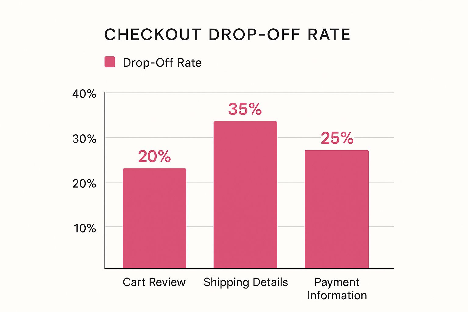
This bar chart illustrates checkout drop-off rates at three critical stages: Cart Review, Shipping Details, and Payment Information. The data shows the highest drop-off rate, 35%, occurring during the Shipping Details stage. This highlights a significant pain point for customers and suggests that optimizing this section can lead to substantial improvements in checkout completion rates. Streamlining form fields and offering clear, concise delivery options within the shipping details section can be key to boosting conversions.
To further illustrate the impact of various design elements on conversions and user experience, let’s examine the following comparison table:
Checkout Design Elements Impact Comparison
| Design Element | Impact on Conversions | Implementation Difficulty | User Experience Benefit |
|---|---|---|---|
| Clear Visual Hierarchy | High (Reduces cognitive load and guides users) | Medium (Requires thoughtful design and layout) | Improves clarity and ease of navigation |
| Strategic CTA Button Placement | High (Prominent buttons encourage completion) | Low (Easy to implement with basic design principles) | Encourages desired actions and reduces friction |
| Streamlined Form Layouts | High (Reduces user effort and frustration) | Medium (Requires careful planning and user testing) | Simplifies data entry and improves completion rates |
| Effective Error Handling | Medium (Prevents errors and guides correction) | Medium (Requires specific error messages and logic) | Reduces user frustration and improves data accuracy |
| Mobile Optimization | High (Caters to the growing mobile user base) | High (Requires specialized design and development) | Improves accessibility and convenience for mobile users |
This table highlights the importance of considering both the impact on conversions and the implementation difficulty when choosing which design elements to prioritize. While some elements may have a high potential impact, they may also require more effort to implement effectively. By carefully balancing these factors, businesses can optimize their checkout design for maximum conversion rates and a positive user experience.
Payment Flexibility That Customers Actually Want
Today’s shoppers expect a smooth and convenient checkout experience, with a range of payment options at their fingertips. However, offering too many choices can overwhelm customers and create unnecessary complexity for your business. This section explores how to find the right balance between offering payment flexibility and maintaining a simple, secure checkout process.
Guest Checkout: Balancing Speed and Data Capture
Requiring account creation is a major reason for cart abandonment. By offering a guest checkout option, you can significantly reduce friction and boost conversions. It’s all about speed and convenience. But how can you gather valuable customer data without slowing things down?
- Offer social logins: Integrating social logins with platforms like Google or Facebook allows customers to checkout quickly using their existing accounts.
- Collect strategic information: Focus on essential information during guest checkout. You can always gather additional details later.
- Incentivize account creation: Encourage account creation by offering exclusive discounts or perks after a guest checkout is completed.
This balanced approach respects the customer’s time while still providing opportunities to build your customer database and encourage future engagement.
Diverse Payment Methods: Meeting Customer Preferences
Offering preferred payment methods plays a crucial role in boosting checkout completion rates. While credit cards are still widely used, providing alternative options caters to a wider audience and enhances the overall checkout experience. Research shows that 56% of shoppers prefer a variety of payment choices at checkout.
- Digital wallets: Integrating popular digital wallets like Apple Pay, Google Pay, and PayPal provides a seamless mobile checkout experience.
- Buy Now, Pay Later (BNPL): BNPL services like Klarna or Afterpay can be especially appealing for higher-priced items, allowing customers to spread out payments.
- International payment options: For businesses operating globally, supporting local payment methods is essential for catering to international customers.
Remember, while offering diverse payment options is important, be mindful of adding too much complexity. Focus on the options most relevant to your target audience.
Payment Interface Design: Prioritizing Security and UX
The payment interface is the last step in the checkout process. It must be designed with both security and user experience in mind. Building trust and confidence is crucial at this stage.
- Clear and concise instructions: Guide customers through the payment process with clear, easy-to-understand instructions.
- Visible security indicators: Display trust badges and security certifications to reassure customers that their information is safe.
- Error handling: Implement helpful error messages that guide customers through any necessary corrections, minimizing frustration.
A focus on payment flexibility and security creates a positive checkout experience for modern shoppers, reducing friction and ultimately driving sales. For effective abandoned cart recovery and further checkout optimization, consider CartBoss, an SMS marketing tool.
Mobile Checkout That Actually Works
Mobile commerce is a huge part of online sales these days. But just shrinking your desktop checkout for mobile won’t work. You need a totally different approach designed for how people actually use their phones. A clunky mobile checkout leads to abandoned carts and lost sales.
Optimizing Form Fields for Touch Interaction
Mobile users tap with their fingers, not click with a mouse. This means form fields need to be optimized for touch. Think larger tap targets and fewer tiny drop-down menus. Features like autofill and input masks for phone numbers and credit cards can make data entry faster and more accurate.
For example, let users pull addresses from their phone’s contact list. Also, make sure the keyboard automatically switches to the right input type (numeric, email, etc.) for each field. These small details can drastically improve the mobile checkout experience. Check out our guide on How to master mobile checkout optimization for more helpful advice.
Mobile Payment Solutions and Biometric Authentication
Take advantage of mobile payment options like Apple Pay and Google Pay. These digital wallets offer a smooth, secure, and easy way for customers to buy.
Also, consider biometric authentication like fingerprint or facial recognition. This boosts security and convenience, simplifying checkout, especially for returning customers.
Maintaining Functionality on Smaller Screens
One of the biggest mobile checkout challenges is keeping all the features while working with a smaller screen. This takes careful planning and smart use of space. A cluttered interface can quickly overwhelm users, leading them to abandon their carts.
Think about revealing information step-by-step. For example, instead of showing all shipping options at once, let users choose their country first, then show the relevant shipping methods. This keeps the screen clean and helps users focus on one choice at a time.
Reimagining Desktop Elements for Mobile
Not everything from your desktop checkout will work on mobile. Some parts might need a total redesign. For instance, long, multi-step checkouts can feel tedious on mobile. Think about combining steps or using a single-page checkout just for mobile users.

Measuring Success and Staying Ahead
Checkout optimization is a continuous process. It requires regular monitoring and adjustments, much like tending a garden. This involves tracking key performance indicators (KPIs) to identify areas for improvement.
Identifying the Metrics That Matter
While numerous metrics exist, some are more insightful than others. Focusing on surface-level metrics, such as website visits, can be misleading. Instead, prioritize metrics directly impacting your bottom line:
- Conversion Rate: The percentage of visitors completing a purchase. A higher rate signals a more effective checkout.
- Average Order Value (AOV): The average amount spent per order. Increasing AOV can significantly boost revenue.
- Cart Abandonment Rate: The percentage of shoppers adding items to their cart but not completing the purchase. A lower rate suggests a smoother checkout experience.
- Checkout Completion Time: The time taken to finish checkout. A shorter time indicates a user-friendly experience. For more information, check out this helpful resource: How to master reducing checkout abandonment.
To illustrate the key metrics to track, let’s look at the following table:
Key Checkout Performance Metrics
Essential metrics for measuring checkout performance and optimization success
| Metric | Target Range | Measurement Method | Optimization Priority |
|---|---|---|---|
| Conversion Rate | 2-5% | Google Analytics | High |
| Average Order Value (AOV) | Varies by Industry | Order Tracking Systems | Medium |
| Cart Abandonment Rate | <70% | Google Analytics | High |
| Checkout Completion Time | <2 minutes | User Testing & Analytics | Medium |
This table highlights the target ranges, measurement methods, and optimization priorities for each key metric. Focusing on these metrics can significantly improve your checkout process.
Setting Up Meaningful A/B Tests
A/B testing is crucial for data-driven optimization. It involves comparing two versions of a checkout element (e.g., button placement, form wording) to determine which performs better. Analyzing these results helps identify impactful changes. For instance, testing a single “Full Name” field versus separate “First Name” and “Last Name” fields can reveal significant differences in completion rates. Research suggests minimizing form fields can improve checkout, and A/B testing helps determine the optimal approach for your audience.
Interpreting User Behavior Data
Data from tools like Google Analytics provides valuable insights into user behavior during checkout. This can pinpoint friction points where users abandon the process or experience errors. For example, high exit rates at the payment stage may indicate security concerns or a confusing payment interface.
Continuous Improvement Through Feedback Loops
Checkout optimization is an ongoing effort. Regular data analysis and user feedback create a continuous improvement loop, enabling iterative changes for maximum performance.
Monitoring Performance Across Segments
Analyzing performance across different customer segments (e.g., new vs. returning, mobile vs. desktop) provides deeper insights. For instance, higher abandonment rates on mobile might indicate a poor mobile experience. This segmented analysis allows for targeted optimization strategies.
By consistently monitoring these metrics, conducting A/B tests, and implementing data-driven changes, you can create a high-performing checkout process that drives sales and fosters customer loyalty. Recover your abandoned carts with CartBoss today! CartBoss, a leading SMS cart recovery tool, can help transform lost sales into profit.