


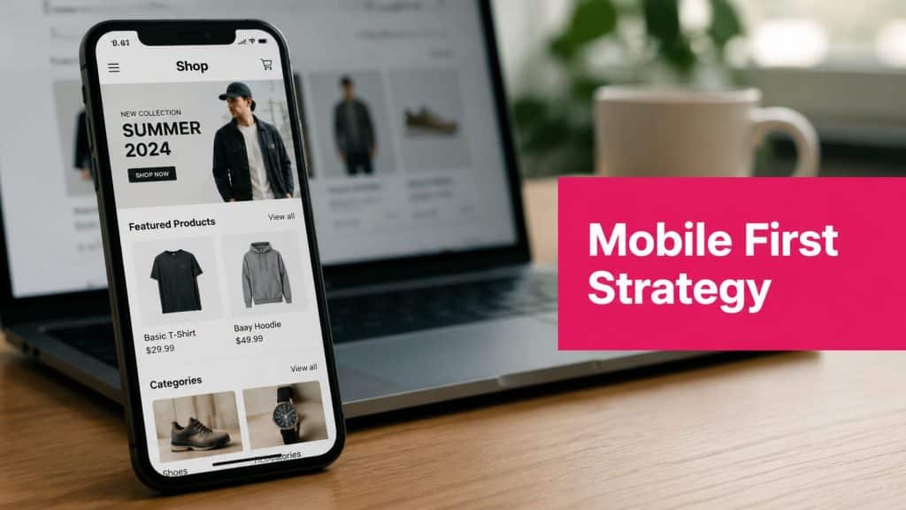
59.31% of all global web traffic came from mobile devices in July 2022, and 79% of shoppers have made purchases on mobile according to Tata Communications. That should end the old debate.
A mobile first strategy isn’t a design preference anymore. It’s a revenue decision. If most of your traffic arrives on a phone, and most shoppers are willing to buy there, every extra tap, slow image, cramped form field, and awkward checkout step costs real money.
Too many stores still treat mobile as a resized desktop experience. The result is familiar. Product pages look crowded, navigation takes too many taps, forms are frustrating, and checkout feels like work. Shoppers leave, not because demand is weak, but because the path to purchase is clumsy.
The fix isn’t cosmetic. It means rebuilding priorities around the way customers browse and buy today. For stores that want stronger conversion, lower abandonment, and better recovery performance, mobile has to become the primary operating model.
Your Customers Are Mobile. Are You?
Mobile traffic is already the default for online retail. The critical question is whether your store is built to convert that traffic into revenue.
A typical e-commerce session now starts on a phone, often from a paid social ad, text message, email, or branded search. The shopper lands with limited patience and one free thumb. If the product page feels crowded, the variant selector is awkward, or checkout asks for too much work, intent drops fast. That visitor does not come back because the product was weak. They leave because the buying experience asked too much from a small screen.
For a broader view of how shopper behavior keeps shifting toward phones, CartBoss breaks it down in this guide to mobile commerce.
Where stores lose revenue on mobile
The pattern is predictable, and it shows up across storefront audits:
- Competing page elements: Sliders, promo bars, chat widgets, sticky pop-ups, and badge stacks push the add-to-cart action lower and split attention.
- Poor content order: Price, delivery timing, size or variant choices, reviews, and return details appear in the wrong sequence for fast decision-making.
- Checkout friction: Small fields, weak autofill support, forced account creation, and hard-to-tap inputs increase abandonment.
- Buried trust signals: Shipping costs, payment methods, and return policies sit behind accordions or secondary pages when shoppers need them before they commit.
These are not design details. They are conversion leaks.
I see the same issue in recovery flows too. Brands spend to bring shoppers back with SMS cart reminders, but the click lands on a mobile experience that still feels slow or cluttered. The message did its job. The site did not. If mobile landing pages and checkout are weak, even high-performing channels like SMS recover less revenue than they should.
Mobile-first execution improves the parts of the journey that directly affect sales: faster product evaluation, easier add-to-cart actions, fewer checkout errors, and stronger recovery performance from mobile channels. Stores that treat mobile as the main buying environment usually see the benefit in two places first. Conversion rates improve, and cart abandonment becomes easier to reduce.
What Mobile First Really Means for E-commerce
Responsive design and mobile first strategy aren’t the same thing.
Responsive design often starts with a desktop layout and adapts it downward. A mobile first strategy starts with the smallest screen and builds upward. That difference sounds technical, but in practice it changes what gets prioritized, what gets removed, and what converts.
According to AltexSoft, a mobile-first strategy means designing for the smallest screen first and using progressive enhancement for larger screens. The same source notes that e-commerce conversion rates increase by 15–20% when touch targets are sized 7–10mm and page load time is kept under 2 seconds.

Mobile friendly versus mobile first
A lot of teams think they’re mobile first because their theme is responsive. That’s not enough.
| Approach | Starting point | What usually happens on mobile | Revenue impact |
|---|---|---|---|
| Mobile friendly | Desktop design | Content gets squeezed, extra elements stay, checkout friction remains | Conversion often suffers because the experience is adapted, not prioritized |
| Mobile first | Smallest screen | Essential content comes first, actions are clearer, pages are lighter | Shoppers reach product and checkout decisions faster |
A simple analogy helps. Mobile-friendly is tailoring a suit after it’s already been made for someone else. Mobile first is cutting the fabric for the person who’ll wear it.
For store owners, that means asking harder questions:
- What does the shopper need first: Price, image, delivery information, reviews, or variant selection?
- What can wait: Secondary banners, oversized menus, long brand stories, and decorative sections.
- What blocks the sale: Slow galleries, hard-to-tap controls, mandatory account creation, and cluttered carts.
What it looks like in practice
A true mobile first strategy usually includes:
- Shorter product pages above the fold: Core buying information appears early.
- Larger tap areas: Buttons and controls are easy to use with one thumb.
- Progressive enhancement: Bigger screens get more layout complexity, not more essential information.
- Performance discipline: Design choices are filtered through speed, not just aesthetics.
If you’re reviewing your current setup, CartBoss also has a practical article on responsive web design best practices that’s worth comparing against your store experience.
Practical rule: If a mobile visitor has to zoom, hunt, or re-read, the page isn’t mobile first.
Why a Mobile First Strategy Boosts Revenue
Mobile first pays off because it removes friction from the highest-volume path to purchase.
That matters more now because customer expectations have changed far beyond retail. As of 2025, 89% of banking customers globally use mobile banking apps, up from 40% in 2015, according to LeanTech. Banking is one of the clearest signals of behavior change. People expect critical actions to work smoothly on a phone. Shopping isn’t judged against other stores anymore. It’s judged against every fast mobile experience they use daily.

Revenue moves first, design follows
When teams treat mobile as the primary storefront, several commercial benefits tend to follow.
- Higher conversion intent capture: Mobile shoppers can act the moment interest appears instead of saving the purchase for later and forgetting.
- Less drop-off in checkout: Simplified forms, better tap targets, and simpler navigation reduce abandonment pressure.
- Stronger acquisition efficiency: Better mobile experiences help paid traffic work harder because more visits reach product and cart milestones.
- Healthier repeat behavior: Shoppers come back when the phone experience feels reliable and fast.
For marketers tightening campaign efficiency, this guide to mobile commerce conversions offers useful ideas on reducing friction after the click.
A mobile first strategy also changes how search visibility supports revenue. Stores that are easier to use on phones tend to align better with what search platforms reward: speed, readability, and clear page structure. SEO doesn’t create sales by itself, but poor mobile UX can choke the traffic you already earned.
The revenue logic is simple
A mobile first store does four things better:
- Shows key information sooner
- Makes actions easier to complete
- Loads with less friction
- Gets more visitors into checkout
This short video gives a useful visual summary of why the shift matters commercially.
If you’re pairing site changes with campaign planning, CartBoss has a solid roundup of mobile marketing strategies that complements the on-site side of the work.
Key Principles of Mobile First Implementation
Good mobile execution isn’t about shrinking a desktop page. It’s about making deliberate trade-offs.
The constraint of a small screen is useful because it forces discipline. You can’t show everything at once, so you have to decide what matters most to the sale.
Start with progressive enhancement
Build the core journey for the phone first. That means product discovery, product detail, cart, checkout, and post-click messaging all need to work cleanly on a small screen before you add richer desktop treatments.
In practice, that usually means:
-
Lead with essential content
Put the product image, title, price, variant selector, shipping clarity, and add-to-cart action where they’re easy to reach. -
Add complexity only when it helps
Comparison charts, large bundles of cross-sells, and deep brand storytelling can still exist, but they shouldn’t bury purchase intent. -
Design for one-thumb use
Buttons, menus, and selectors should be easy to tap without precision.
Build for real network conditions
Many brands often misjudge mobile. They test on a modern office connection and assume the job is done.
According to OneSignal, in India there are 500M+ smartphone users, 94% prefer mobile for online activities, and simplifying navigation with thumb-friendly menus while reducing HTTP requests leads to 30% faster load times and 20% fewer abandoned carts. That isn’t just a UX improvement. It’s a direct conversion and retention issue.
Fast enough on your phone isn’t the benchmark. Fast enough on your customer’s connection is.
The implementation priorities that usually matter most
- Navigation first: Keep category access simple. If users need several taps to find products, paid traffic gets wasted quickly.
- Touch targets second: Small buttons and cramped selectors create errors at the exact moment shoppers are ready to buy.
- Speed throughout: Compress images, lazy load non-essential media, and remove requests you don’t need.
- Checkout discipline: Ask only for information required to complete the order.
If you’re tightening the buying flow, this guide on mobile checkout optimization is a useful next read.
What doesn’t work
Some common mistakes show up again and again:
- Desktop pop-up logic on mobile: Screen-blocking offers often interrupt more than they help.
- Overbuilt product pages: Too many accordions, badges, and sliders hide the main decision points.
- Form overload: Mobile users won’t tolerate unnecessary fields.
- Heavy third-party scripts: Every tool might have a purpose, but the combined weight can drag down the whole experience.
A mobile first strategy works best when teams defend the path to purchase from unnecessary design and technical debt.
Your Mobile First E-commerce Checklist
Most stores don’t need a total rebuild on day one. They need a structured audit, clear priorities, and a realistic rollout plan.

Phase 1 audit your current mobile journey
- Review mobile traffic and revenue paths: Look at where mobile visitors land, where they exit, and which templates carry the most commercial weight.
- Test your top pages manually: Check homepage, collection pages, product pages, cart, and checkout on actual devices.
- Document friction points: Focus on zooming, slow-loading media, sticky elements, field errors, and unclear CTAs.
Phase 2 prioritize content and actions
Ask one question on each page: what is the shopper trying to do right now?
Then adjust the layout around that task.
- Homepage: Guide users into relevant categories or offers fast.
- Collection page: Make filtering and sorting easy without overwhelming the screen.
- Product page: Surface core buying details before secondary content.
- Cart page: Remove distractions and make the next step obvious.
A strong mobile page doesn’t show more. It helps the shopper decide faster.
Phase 3 tighten speed and technical performance
- Compress images: Large media files often create unnecessary delay.
- Use lazy loading carefully: Defer non-essential content without disrupting product understanding.
- Reduce unnecessary scripts: Remove apps and widgets that don’t contribute to conversion.
- Check render order: Critical product and checkout elements should appear fast.
If mobile visibility is part of your growth plan, these essential ecommerce SEO tips are useful because search performance and mobile usability often rise or fall together.
Phase 4 clean up checkout and forms
- Shorten form fields where possible
- Enable autofill and mobile-friendly keyboards
- Keep discount handling simple
- Make payment options easy to identify
- Show shipping costs and delivery expectations clearly
Phase 5 test before scaling changes
- Test across devices: iPhone, Android, different screen sizes, and slower connections.
- Recheck every key path: Add to cart, cart edit, checkout start, payment step, and order confirmation.
- Track outcomes after release: Don’t judge by appearance alone. Judge by movement in conversion and abandonment.
Measuring Success KPIs for Your Mobile Strategy
If you can’t measure mobile performance separately, you can’t improve it properly.
A mobile first strategy should be judged by revenue outcomes, behavior quality, and recovery efficiency. Vanity metrics won’t help much if checkout is still leaking buyers.
Track the metrics that expose friction
Start with your core commerce KPIs:
| KPI | Why it matters | What to look for |
|---|---|---|
| Mobile conversion rate | Shows how well mobile traffic turns into orders | Improvement after UX or checkout changes |
| Mobile bounce rate | Reveals whether landing experiences hold attention | High bounce often signals mismatch, slowness, or clutter |
| Page load time on mobile | Directly affects usability and purchase momentum | Delays usually show up early in drop-off |
| Pages per mobile session | Helps you spot whether users can navigate efficiently | Too low can mean exits. Too high can also mean shoppers are hunting |
| Mobile cart abandonment rate | Measures how many buyers stall after showing intent | One of the clearest indicators of checkout friction |
A screenshot like the one below is useful because it reminds teams that mobile performance isn’t just on-site. Recovery channels matter too.

Add mobile-native recovery KPIs
According to Upsella, mobile cart abandonment reaches 85%, and integrating SMS into recovery sequences boosts overall recovery rates by 16% compared to email-only strategies. The same source states that SMS recovers 10–15% of abandoned carts versus 3–5% for email.
That means mobile measurement can’t stop at the cart page. You also need to track:
- SMS opt-in rate: Are enough mobile shoppers giving permission to be reached?
- SMS click-through quality: Are recovery messages bringing users back to a page that loads cleanly and resumes checkout smoothly?
- Recovered orders from SMS: Which campaigns turn abandoned carts into paid orders?
- Recovered revenue by device path: Did the shopper abandon on mobile and return on mobile, or switch devices?
Recovery performance often exposes on-site problems. A strong SMS click won’t help if the return path is still slow or confusing.
Connect KPIs to decisions
If bounce is high, audit landing pages.
If cart abandonment is high, simplify checkout.
If SMS clicks are healthy but recoveries are weak, inspect the post-click experience first.
The goal isn’t to admire dashboards. It’s to identify where mobile friction is hurting revenue and fix that specific step.
Mobile First in Action Examples and Common Pitfalls
A useful way to judge mobile first strategy is to compare two versions of the same store.
One version looks polished on desktop and acceptable on mobile. The other is built around mobile buying behavior from the start. The second usually wins because it removes hesitation at the exact moments that matter.
A simple before and after scenario
Take a mid-sized apparel store.
Before:
The product page opens with a large banner, a crowded image slider, and several promotional blocks before the size selector and add-to-cart button become visible. The cart page pushes coupon entry, upsells, and account prompts. Recovery depends mostly on email.
After:
The mobile page leads with product image, title, price, variants, shipping clarity, and add-to-cart. Navigation is simpler. Checkout asks for less. Cart recovery uses both SMS and email, so the shopper gets a fast mobile nudge and a secondary reminder later.
That combination matters. According to Geysera, SMS automations for cart recovery achieve conversion rates between 9% and 19% in 2026, and stores using both SMS and email see approximately 30% higher customer lifetime value than single-channel users.
What good execution looks like
- The mobile page answers buying questions early
- The add-to-cart path stays visible and easy to use
- Checkout doesn’t force unnecessary typing
- Recovery messages return shoppers to a frictionless page
If your team also works on apps or retention flows, CartBoss has a relevant piece for mobile app marketers that helps connect on-site behavior with mobile engagement strategy.
Common pitfalls that keep stores stuck
Some stores redesign the interface but keep the same bad decisions underneath.
Watch for these:
- Intrusive pop-ups: They often block product understanding and create accidental exits.
- Too many taps to key information: Shipping, returns, payment methods, and sizing should be easy to find.
- Long mobile checkouts: Every added field increases the chance of abandonment.
- Weak recovery sequencing: Email alone often arrives too late or gets ignored on mobile-heavy journeys.
- Disconnected teams: Paid media, design, development, and retention often optimize different parts of the funnel without a shared mobile conversion goal.
The best mobile first stores don’t just look cleaner. They make buying easier from first click to recovery.
A mobile first strategy works when the whole system aligns. Traffic lands on pages built for phones. Checkout removes friction. Recovery channels bring back shoppers quickly. Revenue improves because fewer mobile buyers get lost on the way to purchase.
Cart abandonment is already expensive on mobile. Recovering that lost revenue doesn’t have to be complicated. CartBoss helps e-commerce stores turn abandoned carts into sales with automated SMS recovery, pre-filled checkout links, built-in compliance features, and detailed analytics that make performance easy to track. If your store is serious about mobile first growth, it’s worth seeing how CartBoss can help you win back buyers who were ready to purchase but didn’t finish.