Optimizing a landing page isn’t just a simple tweak here and there. It’s a strategic process of refining every single element—from the headline that grabs attention to the final click on your call-to-action—all to drive more conversions.
The goal is to enhance the user experience, write copy that actually persuades, and use data-driven testing to turn curious visitors into paying customers. Think of it as paving the smoothest possible road from a click to a sale.
Why Landing Page Optimization Matters
Let’s be real—a landing page isn’t just another page on your website. It’s a specialized tool built for one single, focused purpose. I’ve seen countless businesses pour money into ads only to send that expensive traffic to pages that just don’t convert. It’s like burning cash.
An unoptimized page is a leaky bucket. You can keep pouring traffic into it, but you’ll never see the results you’re hoping for.
The true cost of a bad landing page goes way beyond wasted ad spend. It means lost leads, missed sales, and a terrible first impression of your brand. Every visitor who bounces is a potential customer you might never see again. This is why mastering landing page optimization isn’t just a marketing task—it’s a critical business function.
Setting a Realistic Benchmark
Before you start changing buttons and rewriting headlines, it’s helpful to know what a “good” conversion rate even looks like. Performance varies wildly between industries, but having a baseline keeps you from chasing impossible numbers.
Data is your best friend here. A huge analysis of over 41,000 pages found that the median landing page conversion rate is around 6.6%. This gives you a realistic target to aim for and a solid benchmark for most businesses. You can dive into more stats from the landing page conversion report to see how you stack up.
Knowing these benchmarks helps you frame your efforts and measure success properly. The name of the game is incremental improvement—bumping your conversion rate up, one test at a time.
The Foundational Pillars of Success
A high-converting page is built on a few core pillars. Get these right, and you’re already on your way to better results.
- User-Centric Design: Your layout, visuals, and overall experience need to be dead simple and intuitive. Any friction will cost you conversions.
- Persuasive Copy: Your headline, body text, and call-to-action have to scream value and motivate people to act.
- Data-Driven Testing: Stop guessing. Use A/B testing to make informed decisions and let the data tell you what works.
Focusing on these key areas gives you a solid framework for improvement. To go even deeper into these strategies, check out our guide on how to increase conversion rate.
Building Your High-Conversion Blueprint

A killer landing page isn’t just a random assortment of pretty graphics and catchy phrases. It’s a meticulously designed blueprint, engineered to steer every visitor toward one specific action. This entire process kicks off the second the page loads, in that all-important space “above the fold.”
This is your one shot. Your first impression. Everything a visitor sees without having to scroll has to instantly answer their core question: “What’s in it for me?”
If you can’t make the value obvious in those first few seconds, they’re gone. This is where a strong Unique Value Proposition (UVP) becomes your most valuable asset. Your UVP is a quick, punchy statement that spells out the benefit you deliver, the problem you solve, and what makes you the only real choice.
Crafting a Compelling First Impression
Think of your headline as the tip of the spear. It’s the first thing people read, and its job is to hook them immediately by promising a solution to their problem. A truly great headline is specific, zeroes in on a tangible benefit, and perfectly matches the ad or link that brought them there in the first place.
A generic headline like “Easy Accounting Software” just won’t cut it. It’s boring and forgettable.
Now, consider this: “Finally, Accounting Software That Saves Small Businesses 10 Hours a Month.” See the difference? This one speaks directly to a niche audience (small businesses) and promises a real, measurable outcome (saving time).
The subheading’s role is to back up that bold claim. It adds a little more detail or highlights a secondary benefit, pulling the reader further down the page and creating a smooth, logical flow.
A landing page must deliver on the promise made by the ad that brought the visitor there. Any disconnect in messaging between the ad and the headline is a major cause of high bounce rates. Clarity and consistency are non-negotiable.
The Power of a Single Focused Goal
One of the most common mistakes I see is overwhelming visitors with too many options. A landing page must have one primary goal, which means it needs one primary Call-to-Action (CTA). Are you trying to get sign-ups? Book demos? Drive sales? Pick one. Just one.
Multiple CTAs lead to decision paralysis. When people don’t know what to click, they usually click nothing at all. Your CTA button needs to pop visually, use action-oriented copy (like “Get Your Free Demo” instead of a passive “Submit”), and be placed right where the user is ready to make a move. The entire page, from the headline down to the testimonials, should funnel visitors directly to that single action. Getting this right is a fundamental part of effective conversion funnel optimization.
Building Instant Credibility with Social Proof
Before anyone is going to give you their email address, let alone their credit card number, they have to trust you. This is where social proof comes in to build that credibility—fast.
Placing these trust signals strategically can make a huge difference in your conversion rates. Here’s what I’ve found works best:
- Testimonials: Use direct quotes from happy customers that highlight specific results or benefits they got from using your product.
- Client Logos: If you’ve worked with well-known companies, showing their logos is a powerful and immediate form of endorsement.
- Case Studies: A short summary or a link to a detailed success story gives visitors deep, concrete proof that you deliver on your promises.
- Star Ratings: These are simple, visual, and universally understood. People process them in a split second.
By weaving these elements into your page, you create a seamless experience that answers questions, eases doubts, and confidently guides visitors from the moment they arrive to the moment they convert.
Mastering Persuasive Copy and Visuals
A high-converting landing page is really a masterclass in psychology. It has to connect with visitors through powerful words and carefully chosen visuals that work together, telling a story that clicks.
Too often, I see pages that just list features, leaving the visitor to do the mental gymnastics of figuring out why they should even care.
Effective copy flips this script completely. It’s all about benefits, not just features. Instead of saying, “Our software has 128-bit encryption,” you should be saying, “Keep your client data safe and secure with military-grade encryption.” One describes what it is; the other explains what it does for the user. This simple shift puts the customer at the center of the conversation.
Writing Copy That Connects
Your words are your number one sales tool. Every single sentence should gently guide the user closer to that “yes,” building trust and showing them exactly what they’ll gain. Great copy should feel like a natural conversation, not a stuffy corporate lecture.
Use the language your audience uses every day. Ditch the jargon and corporate-speak that just creates distance. Be direct, be clear, and show some empathy. It makes your message instantly relatable. To really nail this, it’s worth exploring SEO copywriting best practices to make sure your words not only connect but also get found.
The single most important job of your copy is to answer the visitor’s unspoken question: “What’s in it for me?” If every line on your page helps answer that, you’re on the right track.
This is especially true when it comes to personalization. The data doesn’t lie—tailoring your message has a massive impact. Companies with 31 to 40 landing pages generate seven times more leads than those with just a handful. Why? Because they can create more targeted, relevant experiences. Even something as simple as a personalized call-to-action can convert 202% better than a generic one.
Using Visuals and Design Strategically
Visuals aren’t just there to look pretty; they’re a critical part of communication. The right image or video can convey a complex idea in seconds and spark an emotional response that words alone just can’t match.
- High-Quality Images: Use professional photos showing your product in action or featuring people your audience can relate to. Please, avoid generic stock photos. They scream “inauthentic” from a mile away.
- Whitespace: Don’t cram your page full of text and images. Giving elements room to breathe (what designers call whitespace) makes your page easier to read and helps guide the user’s eye right where you want it to go—like your CTA button.
- Color Psychology: Colors have power. Blue often signals trust and stability, while orange can create a sense of urgency. Choose a color palette that lines up with your brand and the action you want users to take.
Before you hit “publish,” it’s always a good idea to run through a quick checklist to make sure you’ve covered all your bases.
High-Impact Landing Page Elements Checklist
| Element | Optimization Goal | Quick Tip |
|---|---|---|
| Headline | Grab attention and communicate the main benefit instantly. | Make it benefit-driven and specific. Ask: “Would I click this?” |
| Hero Image/Video | Create an emotional connection and show the product/service in context. | Use a high-quality, authentic visual of your product in use. |
| Benefit-Oriented Copy | Clearly answer “What’s in it for me?” for the visitor. | Frame every feature as a solution to a customer’s problem. |
| Social Proof | Build trust and credibility with testimonials, reviews, or logos. | Place a strong testimonial near your main call-to-action. |
| Call-to-Action (CTA) | Make the next step obvious, compelling, and easy to take. | Use action-oriented text (e.g., “Get My Free Plan”) on a high-contrast button. |
| Mobile Responsiveness | Ensure a seamless experience on all devices, especially smartphones. | Test on a real phone, not just a browser emulator. Check button sizes. |
This checklist isn’t exhaustive, but it covers the non-negotiables. Getting these right is a huge step toward a page that actually works.
A Mobile-First Design Philosophy
These days, assuming your visitors are on a desktop is a massive, costly mistake. A mobile-first approach isn’t just a good idea; it’s essential. This means you design the mobile experience first and then adapt it for larger screens—not the other way around.
On a smaller screen, every element has to fight for its place. That means large, easy-to-tap buttons, readable fonts, and a simplified layout that cuts out all the noise. A flawless mobile experience is key to capturing conversions wherever your audience is. For more on this, check out these crucial ecommerce UX best practices.
Using Data to Drive Your Optimization Strategy
Forget guesswork. Real, lasting improvements to your landing page don’t come from gut feelings—they come from data. When you methodically test elements and analyze how people actually behave on your page, you can finally move beyond what you think works and discover what truly drives conversions.
This whole process kicks off with a solid hypothesis. Before you touch a single thing, you need to be crystal clear on what you’re testing, why you’re testing it, and what result you expect. A good hypothesis sounds something like this: “Changing the CTA button text from ‘Submit’ to ‘Get My Free Quote’ will boost form submissions by 15% because the new text is more specific and highlights the value.” This gives your A/B test a clear purpose from the get-go.
Pinpointing High-Impact Test Elements
Sure, you can test just about anything on a landing page, but some changes pack a much bigger punch than others. If you want to see meaningful results without waiting forever, it’s smart to focus your initial efforts on these high-impact areas first.
Here are the usual suspects for generating the biggest lifts in performance:
- The Headline: This is your first impression, so make it count. Test different angles—try framing a pain point versus a benefit and see what resonates.
- The Call-to-Action (CTA): This is a huge one. Experiment with the button’s text, color, size, and even where you place it on the page. A tiny tweak here can lead to surprisingly massive results.
- Hero Image or Video: Your main visual sets the entire mood. Test a static image against a quick video, or try out different photos that stir up different emotions.
- Form Length and Design: Are you asking for too much info upfront? Try cutting out non-essential fields to reduce friction. You might be surprised how much your completion rate jumps.
This graphic breaks down a simple, effective way to test your CTA button.
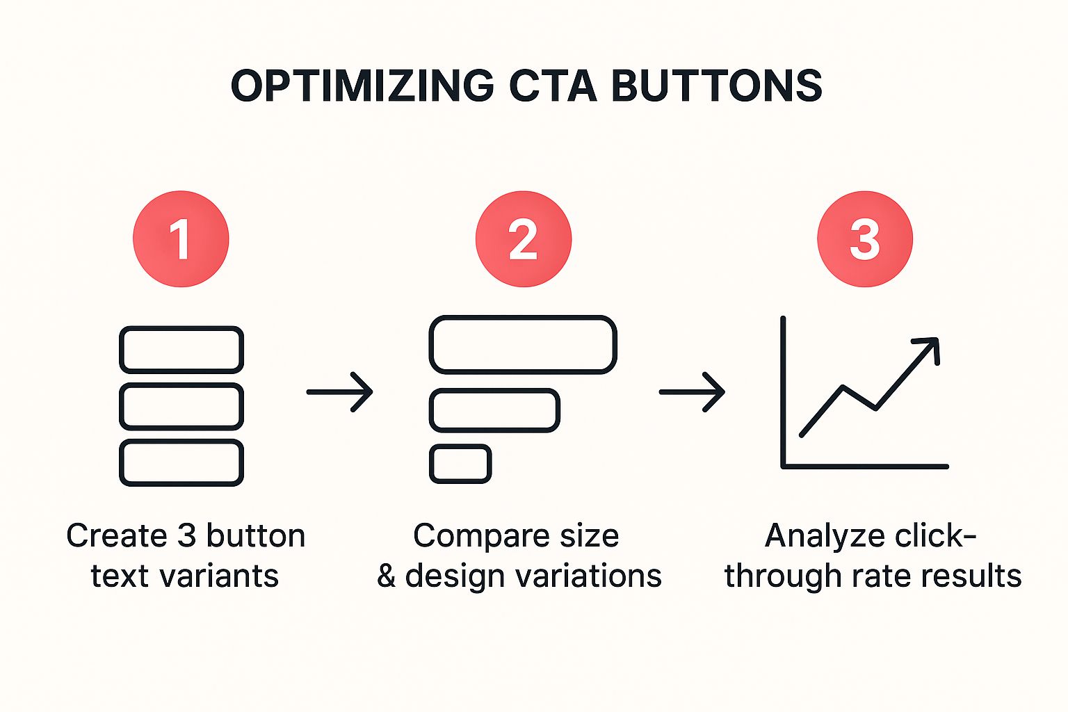
It lays out a structured approach: start by testing different copy, then move on to design tweaks, and finally, analyze the click-through rates to crown a winner.
Decoding Key Performance Metrics
A/B testing will throw a ton of data your way, but raw numbers don’t mean much on their own. You have to know how to interpret them. Understanding what the key metrics are telling you about user behavior is what separates amateur optimizers from the pros.
Key Takeaway: Your goal is to build a continuous feedback loop. The results from one test should directly inspire the hypothesis for your next one. This iterative process is the engine that drives constant improvement.
To really make sense of your results, you need a firm handle on your core analytics. Metrics like bounce rate, time on page, and of course, your conversion rate each tell a piece of the story. For a deeper dive into this, our guide on how to analyze website traffic offers a detailed breakdown of what these numbers really mean and how to act on them. This data-first approach turns optimization from a guessing game into a science.
Advanced Strategies to Maximize Performance
Alright, you’ve nailed the fundamentals of a solid landing page. Now it’s time to go from “good” to “unstoppable” by layering in some more advanced tactics. This is where you move beyond just A/B testing headlines and start fine-tuning the technical and strategic elements that truly separate the pros from the amateurs.
One of the most common—and fatal—mistakes I see is neglecting page speed. A slow-loading page is the ultimate conversion killer. If your visitors are waiting, they’re not converting. They’re leaving. Optimizing your images, cleaning up your code, and investing in quality hosting aren’t just suggestions; they’re non-negotiable if you want to keep people engaged from the second they land.
Personalization Through Dynamic Text
Want to make a visitor feel like you read their mind? Use dynamic text replacement (DTR). This slick technique automatically changes words on your landing page to match the exact ad or search term someone clicked on.
Imagine a user searches for “blue running shoes” and clicks your ad. With DTR, your landing page headline instantly reads “The Best Blue Running Shoes” instead of a generic “Shop Our Shoe Collection.” This creates a perfect message match, immediately telling visitors they’re in the right spot. It’s a simple change that makes the experience feel custom-built, and it works wonders for conversion rates.
Key Insight: Personalization isn’t a fancy add-on anymore; it’s what customers expect. People respond to content that feels like it was created just for them, and DTR is a powerful way to deliver that at scale.
If you really want to get ahead of the curve, you can start leveraging generative AI to spin up dozens of hyper-personalized copy variations. This lets you test a massive number of unique messages without sinking hours into manual copywriting.
Implementing a Recovery Safety Net
Let’s be real: no matter how perfect your landing page is, some people will leave without converting. Life happens. They get distracted, have second thoughts, or the dog starts barking. That’s where a recovery strategy becomes your secret weapon—a safety net that catches leads you would have otherwise lost forever.
Take a look at the CartBoss homepage. The message is crystal clear: turn abandoned carts into profit with automated SMS.
This proactive approach is what it’s all about. You’re not just waiting for customers to come back; you’re actively bringing them back on autopilot.
This is exactly why tools like CartBoss are so essential. When a visitor abandons a form or checkout, CartBoss can automatically send a timely SMS reminder to bring them back. Here’s why it’s so ridiculously effective:
- Insane Visibility: SMS messages have a nearly 99% open rate. Compare that to your email marketing stats. It’s not even a fair fight.
- Immediate Action: A text message feels personal and urgent. It cuts through the noise and prompts people to finish what they started.
- Zero Friction: The message can include a pre-filled checkout link, making it incredibly easy for the customer to pick up exactly where they left off. No need to re-enter all their info.
Putting a solid recovery system in place is one of the most impactful advanced digital marketing strategies for maximizing ROI. It ensures all your hard work doesn’t go to waste on visitors who slip through the cracks, turning what would have been lost sales into a serious boost for your bottom line.
Different Strokes for Different Folks: Tailoring Your Approach by Industry
A killer landing page for a B2B software company will look completely different from one selling sneakers. It seems obvious, but you’d be surprised how many people try to apply a one-size-fits-all template.
The truth is, your audience, what they want, and what you consider a “conversion” are worlds apart depending on your industry. Real success comes from ditching the magic formula and tailoring your strategy to who you’re actually talking to.
B2C E-commerce vs. B2B Lead Generation
Let’s get practical. A SaaS business trying to land enterprise clients needs a page that screams trust and expertise. The goal isn’t an instant sale; it’s about starting a conversation.
Here, the copy needs to be detailed, focusing on ROI and solving complex business problems. You’ll lean heavily on social proof like case studies and well-known client logos. The call-to-action is softer, something like “Book a Demo” or “Download Our Whitepaper.”
Now, flip that on its head for a B2C e-commerce page selling a new pair of shoes. The customer’s journey is way shorter and driven by emotion. The page has to be a visual feast—think high-res product photos and maybe a video of someone actually running in them.
The goal is a direct sale, right now. The copy is punchy, hitting on style, comfort, and feeling. Social proof comes from star ratings and customer reviews. The CTA is direct and creates urgency—”Buy Now” or “Add to Cart.” Mixing these two approaches would be a complete disaster.
The core idea is simple: align your landing page with your industry’s buying cycle. A B2B deal can take months and involve multiple people. A B2C purchase can happen in minutes. Your page has to respect that reality.
Setting Realistic Goals for Your Niche
Understanding these differences also keeps your expectations in check. Performance benchmarks swing wildly from one industry to another.
For example, the catering and restaurant industry often crushes it with an average landing page conversion rate of 18.2%. It makes sense—the offer is usually simple, visual, and immediately desirable.
Meanwhile, e-commerce averages around 12.9%, and SaaS is a bit lower at 9.5%. Industries with a longer, more considered purchase, like medical services, see medians closer to 5.9%. You can dig into more conversion stats to see where you stack up.
Knowing these numbers stops you from chasing impossible targets. It helps you measure success in the context of your market. Whether you’re after leads, sales, or subscribers, your strategy has to be built for your unique industrial landscape.
Answering Your Biggest Landing Page Questions
Even when you feel like you’ve got a solid plan, a few questions always seem to pop up during the landing page optimization process. Let’s run through some of the most common ones I hear to clear things up so you can move forward.
One of the first things people ask is: what’s a “good” conversion rate? While you can look up industry benchmarks to get a rough idea, the honest answer is it depends. A good rate for you is one that’s getting better every month. Your real competitor is your past performance.
Another big one is about A/B testing. How long do you let a test run? There’s no magic number of days. You need to run it until you hit statistical significance. That’s just a fancy way of saying you have enough data to be confident the results are real and not just random luck. For a high-traffic page, that might be a week. For a page with less traffic, you might need to let it run for a month.
How Many Things Should I Test at Once?
This is where a lot of people trip up. It’s tempting to change the headline, CTA button color, and the main image all at once, but that’s a huge mistake. If conversions go up (or down), you’ll have absolutely no clue which change was responsible.
For reliable insights, always stick to testing one element at a time. This is the core principle of A/B testing (or split testing), and it’s what allows you to say with certainty, “Changing X resulted in Y.”
Once a test finishes and you have a clear winner, lock in that change. Then, you can move on to testing the next thing on your list. This creates a simple, methodical cycle of continuous improvement that’s backed by actual data, not just gut feelings.
- Multivariate Testing: You might hear about this more advanced method. It tests multiple combinations at once, but it needs a ton of traffic to give you results you can trust. Stick to A/B testing unless you have massive volume.
- Focus on the Big Movers First: Don’t start by testing the color of your footer link. Go for the high-impact stuff first: your headline, your main call-to-action, and your hero image or video. These are the elements that usually deliver the biggest wins.
At the end of the day, optimizing a landing page is like being a detective. You form a hypothesis (“I think a clearer headline will work better”), test it in isolation, study the clues (the data), and use what you learned for your next experiment. It’s a disciplined approach that swaps guesswork for a reliable system to boost your conversions.
Ready to recover lost sales and turn abandoned carts into profit? CartBoss uses the power of automated SMS to bring customers back, boosting your revenue on autopilot. Stop losing customers and start maximizing your ROAS today.