Let’s be honest, every abandoned cart feels like a punch to the gut. It’s the digital equivalent of a customer walking through your store, filling their basket to the brim, and then ditching it right at the checkout counter. This isn’t just a minor hiccup; it’s a massive, hidden drain on your revenue, happening every single day.
You can’t fix what you don’t understand. The key to slashing your cart abandonment rate is digging into why shoppers are leaving and smoothing out those friction points in their buying journey. It’s about being transparent, making checkout a breeze, and having a solid game plan to bring them back.
The Hidden Drain on Your Ecommerce Revenue

It’s easy to dismiss abandoned carts as just “window shoppers,” but the reality is much more costly. This is a significant revenue leak that silently sabotages your growth and profitability.
Understanding The Scope Of The Problem
The numbers here are pretty staggering. The global average cart abandonment rate is hovering around 70%. Think about that—for every ten shoppers who add something to their cart, seven of them walk away without buying.
This adds up to an estimated $18 billion in lost sales for e-commerce retailers every single year. This isn’t just about a customer changing their mind; it’s often a direct signal that something in your sales process is broken.
To really see how this is impacting your own store, you need solid data. This means fixing your Google Ads conversion tracking and using analytics to pinpoint where the leaks are happening so you can measure the impact of your fixes.
Why Do Shoppers Leave?
Shoppers bail for all sorts of reasons, but most of them fall into a few common buckets. Once you know what they are, you can start building your defense.
Before we dive into the specific strategies, it’s helpful to see the big picture. Here’s a quick rundown of the most common issues we see and the core strategies to combat them.
Common Cart Abandonment Issues and Solutions
| Problem Area | Why It Happens | Core Strategy |
|---|---|---|
| Costs | Unexpected shipping fees or taxes pop up at the last second, causing sticker shock. | Be upfront about all costs. Display shipping estimates early or offer free shipping thresholds. |
| Accounts | Forcing a new customer to create an account before they can buy adds a frustrating hurdle. | Offer a streamlined guest checkout option. Make account creation optional post-purchase. |
| Checkout | The process is too long, asks for too much info, or is just plain confusing. | Simplify your checkout form. Use progress bars and enable auto-fill options. |
| Trust | The site looks dated, lacks security badges, or has a vague return policy. | Add trust signals like SSL certificates, customer reviews, and a clear, easy-to-find return policy. |
These are the big four we see time and time again.
- Unexpected Costs: This is the number one killer. High shipping fees, taxes, or other random charges that only appear at the very end are a surefire way to lose a sale.
- Forced Account Creation: Nobody wants to create another account just to buy one thing. It’s a barrier that feels unnecessary and time-consuming.
- Complex Checkout Process: If your checkout feels like filling out a tax form, you’ve already lost. A long, confusing, or multi-page process just gives shoppers more time to second-guess their purchase.
- Lack of Trust: First-time buyers are naturally skeptical. If your site looks unprofessional or doesn’t proudly display security badges and clear return policies, they’ll hesitate to hand over their credit card info.
By identifying these friction points on your own site, you can stop looking for a single magic bullet. Instead, focus on making a series of small, targeted improvements. These changes add up, creating a much smoother journey for your customers and building the confidence they need to click “complete purchase.”
For a much deeper dive, you can check out our guide on the top reasons why customers abandon their carts.
Build Customer Trust from Homepage to Checkout
Trust isn’t just a “nice-to-have” on your site; it’s the invisible currency behind every single sale. The moment a customer feels a flicker of doubt, their mouse drifts toward that “close tab” button. Honestly, one of the best ways to stop abandoned carts is to build rock-solid confidence from the second they land on your homepage.
It all starts with radical transparency, especially when it comes to money.
Have you ever gotten to the final step of a purchase, only to be hit with a surprise fee? It’s infuriating. In fact, hidden costs are the #1 reason people abandon carts. Nearly half of all shoppers will ditch their order if they see unexpected shipping fees, taxes, or other charges pop up at the last second.
Eliminate Surprise Costs
Whatever you do, don’t make your customers wait until the final payment page to see their real total. It feels like a bait-and-switch, and that’s a surefire way to kill trust. Be upfront about every possible cost, right from the get-go.
- Add a shipping calculator: Let people punch in their zip code on the product or cart page. They’ll get an instant shipping estimate, no surprises.
- Promote free shipping thresholds: If you offer deals like “Free shipping on orders over $50,” shout it from the rooftops. Put it in your site header, on product pages, and in the cart. This turns a potential cost into a powerful incentive.
- Be clear about taxes: If you can, show an estimated tax amount based on their location before they get to the final payment screen.
By showing the full picture early, you manage expectations and prevent the sticker shock that sends so many customers running. A shopper who sees all the costs and still moves forward is far more committed to buying.
Strategically Showcase Trust Signals
Beyond pricing, shoppers are always subconsciously scanning your site for cues that say, “This place is legit, and my information is safe here.” These are your trust signals, and they act like digital handshakes, reassuring customers at every turn.
The trick is placing them where they’ll have the most impact without cluttering your design.
Put yourself in the customer’s shoes. On a product page, they’re thinking about the item itself, so a clear, easy-to-find return policy is huge. Once they’re in the cart, their focus shifts to payment, making security badges non-negotiable.
Here are the essential signals and where to put them for maximum effect:
- Security Badges: Logos from known services like Norton or McAfee (or even a simple “Secure Checkout” badge) belong right in the checkout area, near the credit card fields. This is where security anxiety peaks.
- Clear Return Policy: Don’t just hide your return policy in the footer. Summarize the best parts (e.g., “30-Day Free Returns“) right there on your product pages and link out to the full details.
- Authentic Customer Reviews: Nothing builds confidence like social proof. Use a system that displays real, unedited reviews on your product pages. A healthy mix of glowing reviews and a few constructive ones feels way more authentic than a wall of perfect 5-star ratings.
- Accepted Payment Logos: Display the logos for Visa, Mastercard, PayPal, and Apple Pay in your site’s footer, and then show them again right near the payment section of your checkout. Familiarity breeds confidence.
When you weave these elements of transparency and security throughout the shopping journey, you build a foundation of trust. That trust is what makes clicking “Complete Purchase” feel like a safe, smart decision instead of a gamble.
Streamline Your Checkout for Effortless Sales
A clunky, confusing checkout is the fastest way I’ve seen to lose a motivated buyer. I always think of it like the final hundred feet of a marathon—if you suddenly throw a bunch of hurdles in front of the runner, they’re probably going to give up. The real goal here is to make buying from you so easy and intuitive that the customer barely even has to think about it.
This whole process kicks off by ditching the single biggest point of friction for new customers: forced account creation. Demanding a shopper create an account before they can give you their money is a massive conversion killer. Instead, you should always offer a prominent guest checkout option. You can always invite them to create an account on the “thank you” page after the sale is locked in.
Keep It Simple and Show the Way
Once a customer commits to buying, your main job is just to get out of their way. This means being absolutely ruthless about simplifying your checkout forms. Only ask for the bare essentials needed to process and ship the order.
- Essential Fields: Name, shipping address, and payment info. That’s it.
- Optional Fields: Maybe a phone number (for shipping updates only) or a simple checkbox to join your marketing list.
As they move through the steps, a visual progress indicator works wonders. A simple bar showing something like “Shipping > Payment > Review” helps manage their expectations and lets them know they’re almost at the finish line. It’s a small touch that reduces the chance they’ll feel overwhelmed and bounce. For a deeper dive into perfecting this final part of the sales funnel, this Shopify checkout optimization guide is an excellent resource.
Surprise costs are the number one reason for abandonment. I’ve seen the data, and it’s stark: approximately 48% of shoppers ditch their carts because of unexpected costs like shipping, taxes, or other fees that pop up right at the end. Always be transparent with costs upfront.
Prioritize the Mobile Experience
These days, most of your traffic is coming from smartphones, so a “mobile-first” approach isn’t just a good idea—it’s mandatory. Your checkout absolutely must be flawless on a small screen. This means big, easy-to-tap buttons and form fields that automatically pull up the right keyboard (like a number pad for the credit card field).
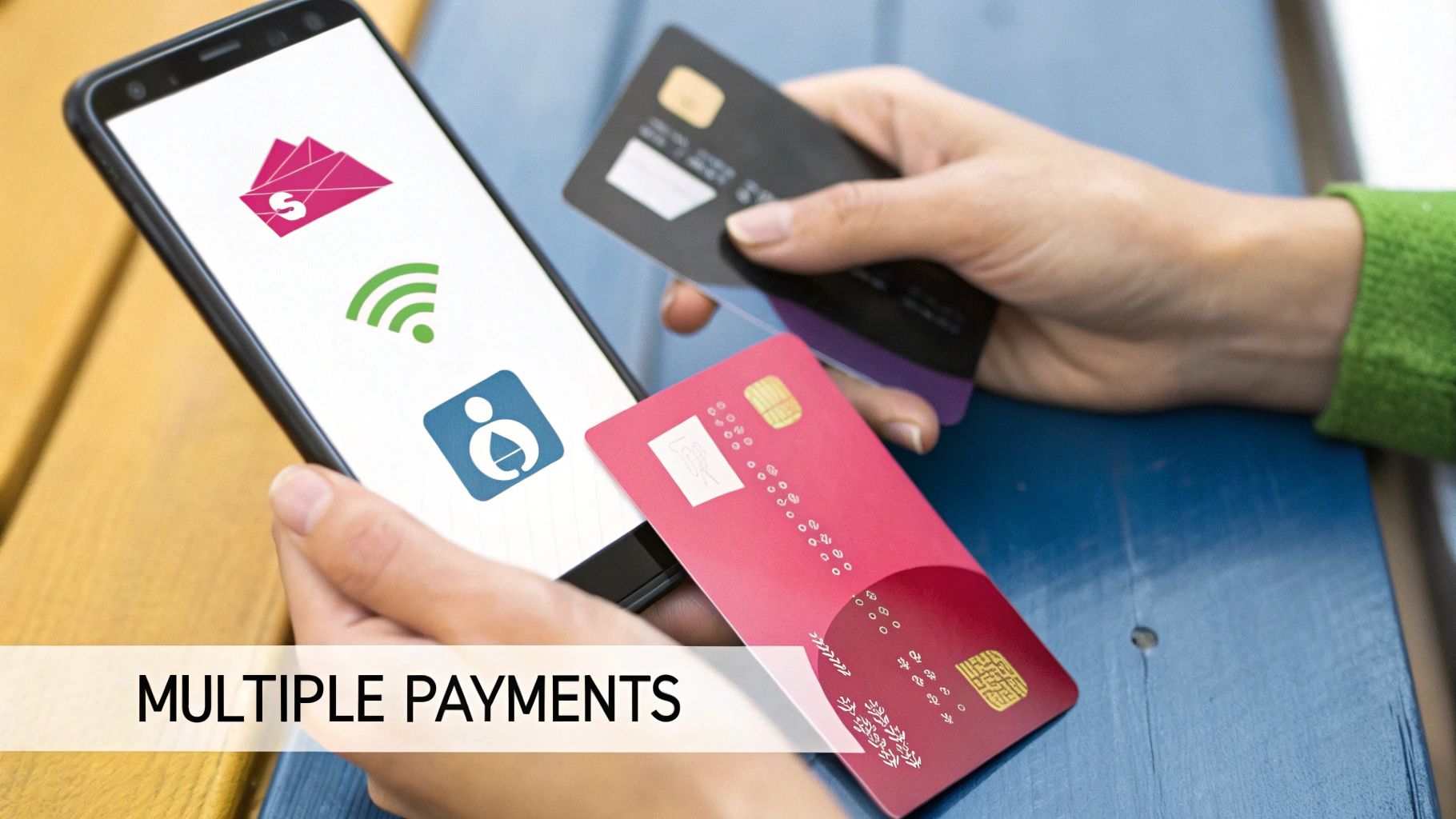
You should also use browser autofill capabilities to instantly populate shipping and billing addresses. Every single field a customer doesn’t have to type out manually is a small victory. But the ultimate mobile optimization is integrating one-click payment options.
These methods make buying almost frictionless:
- Apple Pay
- Google Pay
- Shop Pay
- PayPal One Touch
By securely pulling stored payment and shipping information, these digital wallets let customers bypass all the manual entry, which dramatically speeds up the entire process. This isn’t just a convenience; it’s a critical step to reduce checkout abandonment and capture sales that would otherwise be lost to simple frustration or distraction.
Crafting Recovery Campaigns That Actually Work
Even with a perfectly optimized site, some shoppers will inevitably get distracted or hesitate. It happens. This is where your recovery strategy comes into play, acting as a friendly and persuasive nudge to bring those customers back and close the sale. A well-crafted recovery campaign can honestly be one of the most profitable systems in your entire business.
The key is moving beyond those generic, one-size-fits-all reminders. I’ve seen it time and time again: a single “You left something behind!” email is easy to ignore. But a thoughtful sequence of messages using both email and SMS? That’s what dramatically improves your chances.
The Power of a Timed Sequence
Your recovery campaign shouldn’t be a single blast. It needs to be a carefully timed series of messages where each touchpoint has a different job to do.
- The First Hour Reminder: This first message should be a simple, helpful nudge. Your best bet is to assume the customer was just distracted. Keep the copy light and focused on convenience—something like “Ready to complete your order?” with a direct link that takes them straight back to their pre-filled cart.
- The 24-Hour Follow-Up: If that first message didn’t get a click, it’s time to gently introduce a reason to act now. This is a great place to reinforce what makes you great. Remind them of your easy returns, killer product quality, or even mention that the items are popular and might sell out.
- The 3-Day Final Offer: This is your last-ditch effort and the perfect time to roll out a compelling incentive. A small discount or an offer for free shipping can be just the motivation a hesitant shopper needs to finally commit.
Personalization is what really drives these campaigns. Generic messages get generic results. Personalized messages, on the other hand, make the customer feel seen and understood, and that’s always reflected in their performance.
This infographic lays it out perfectly. It visualizes the massive impact that personalization has on both engagement and, more importantly, conversions.
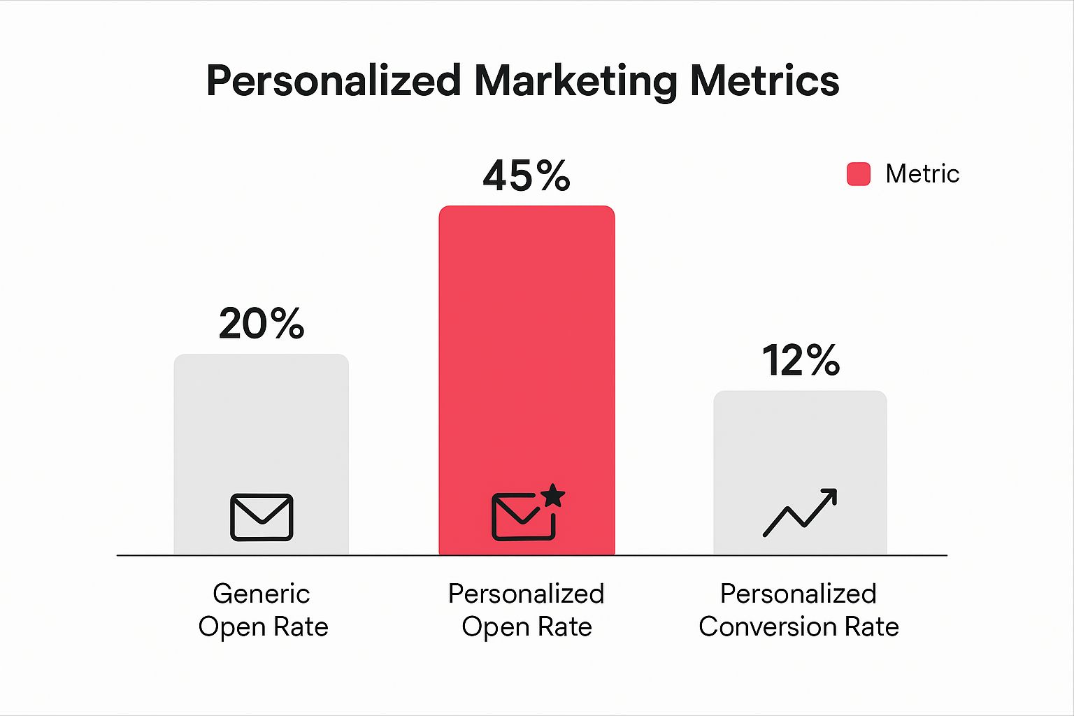
The data speaks for itself. Shifting from a generic blast to a personalized message more than doubles open rates and can boost conversions from almost nothing to a significant 12%.
Choosing the Right Channel: Email vs. SMS
While email has long been the workhorse for cart recovery, SMS is quickly becoming a powerhouse. The choice isn’t really about email versus SMS; it’s about using them together for maximum impact. While many abandoned cart recovery strategies start with email, bringing SMS into the mix can be a total game-changer.
To make it simple, here’s a quick breakdown of when to use each channel based on what they do best.
Email vs SMS for Cart Recovery
| Metric | Email Recovery | SMS Recovery |
|---|---|---|
| Open Rate | Averages around 20-25% | Averages 98% or higher |
| Urgency | Good for detailed reminders & showcasing products | Excellent for time-sensitive offers & immediate action |
| Best Use Case | The first 1-2 reminders; great for visual product reminders and more detailed info. | The final offer, especially for high-value carts or time-sensitive promotions. |
Think of it this way: use email to remind and educate, and use SMS to create urgency and drive an immediate response.
A text message like “Your cart expires in 3 hours! Use code SAVE10 to get 10% off now” is far more impactful than the same offer buried in an email. By using both channels, you build a robust system that meets customers on their preferred platform, which will absolutely improve your ability to slash those abandonment rates and recover what would otherwise be lost revenue.
Nudge Shoppers Forward with a Personal Touch

A generic “You left something in your cart!” email is the digital equivalent of yelling into a void. It’s white noise, and your customers are experts at tuning it out. If you really want to bring those shoppers back, your approach needs to feel personal—a gentle nudge that says “we’re here to help,” not “please buy this!”
It’s about getting smarter with the data you already have, moving past the one-size-fits-all messages. And the opportunity here is massive. Every year, about $4 trillion worth of merchandise is left in online carts. But here’s the kicker: with a little optimization and personalization, an estimated $260 billion of that is recoverable. That’s a huge slice of the pie just waiting for you.
Segment Carts for Smarter Incentives
Look, not all abandoned carts are created equal. Someone bailing on a $20 t-shirt has a completely different mindset than someone who just left a $500 piece of tech behind. Segmenting your abandoned carts is key to offering the right incentive without torching your profit margins.
Try breaking them down like this:
- High-Value Carts: This is where the stakes are highest. For these shoppers, a small percentage-based discount—think 5% or 10% off—can feel substantial and is often the perfect push they need to commit.
- Low-Value Carts: A percentage discount on a cheap item might only save them a buck or two, which is hardly motivating. Instead, try offering free shipping. It removes one of the most common and annoying checkout hurdles.
- Loyal vs. New Customers: Your regulars might just need a quick, friendly reminder. A first-time shopper, on the other hand, might need a little more reassurance. An offer like free returns or a small welcome discount can build that crucial initial trust.
The goal is to deliver the right incentive to the right person. By segmenting, you stop giving away margin unnecessarily and save your best offers for where they’ll make a real impact.
Create Helpful Urgency, Not Annoying Pressure
Urgency is a powerful psychological trigger, but there’s a fine line between creating a genuine reason to act and just stressing people out with aggressive countdown timers. The trick is to frame it as a benefit for them. If you want to see this done right, check out these killer ecommerce personalization examples for inspiration.
One of my favorite ways to create this kind of helpful urgency is with a well-timed exit-intent popup. The moment a user’s cursor drifts towards the ‘X’ on their browser tab, a popup appears with a final, friendly offer.
Something like, “Wait! Take 10% off to finish your order,” or “Before you go, let us email you your cart so you don’t lose it.” It respects their decision to leave while giving them one last compelling reason to stick around. It’s a simple move that can turn a lost sale into a smart, last-minute decision by the shopper.
Common Questions About Reducing Abandoned Carts
When you’re trying to figure out how to reduce abandoned carts, it’s easy to get lost in all the data and different strategies. I see it all the time with store owners—they know there’s a problem, but a few key questions always seem to bubble up.
Let’s cut through the noise and tackle some of the most common ones I hear.
What Is a Good Cart Abandonment Rate?
This is the big one, isn’t it? While you’ll see a global average thrown around—a pretty shocking 70%—a “good” rate really comes down to your specific industry and what you’re selling.
But if you want a benchmark, most e-commerce pros would agree that getting your rate below 60% is a solid win. Drop it under 50%, and you’re in a really strong position.
My advice? Stop chasing some universal magic number. Instead, focus on your own trends. A consistent, month-over-month improvement is what really matters. Aiming for a 5-10% reduction from where you are right now is a fantastic and totally achievable first goal.
Should I Offer Discounts in Every Recovery Email?
Tread carefully here. The short answer is a hard no.
If you lead with a discount in your very first recovery message, you risk training your customers to abandon carts just to snag a deal. That’s a quick way to kill your profit margins.
A much smarter play is to use a timed sequence. It’s something we’ve seen work time and time again:
- First Message (within 1 hour): Send a simple, friendly reminder. Just a helpful nudge. Assume they got distracted or had to step away. No discount.
- Second Message (around 24 hours): Double down on the value. Remind them why they wanted the product in the first place—talk about its benefits, your awesome return policy, or point to some great reviews.
- Third Message (48-72 hours): Now you can bring out an incentive. This is the perfect time for a small discount or a free shipping offer to be the final push they need.
This tiered approach saves your best offers for when they’ll actually make a difference, rather than just giving away margin.
The best strategies don’t just focus on recovery; they aim to stop abandonment before it even happens. Getting to the root of the problem is your first real step. For a deeper look, check out our guide on the primary reasons for cart abandonment to help diagnose what might be going on.
How Quickly Should I Send the First Recovery Message?
Timing is absolutely everything. All the data points to the same conclusion: that first follow-up needs to go out within one hour of abandonment.
Right after a customer leaves, their intent to buy is at its peak. A quick, friendly message can pull them right back in. If you wait any longer, you give them too much time to cool off, find a competitor, or just completely forget why they were on your site.
Ready to turn those abandoned carts into profit automatically? CartBoss uses powerful, automated SMS campaigns to recover lost sales and boost your revenue on autopilot. Stop losing customers and start converting them. Discover how CartBoss can transform your business today!