
Why Your Checkout Experience Makes or Breaks Conversions

Your checkout experience is the final hurdle in the customer journey. It’s the moment a potential customer becomes a paying one, the culmination of all your marketing efforts. Think of it like the finish line of a marathon: even a strong start can be undone by a weak finish. Optimizing this crucial stage is paramount for any successful e-commerce business.
The Impact of a Smooth Checkout
A seamless checkout minimizes friction, encouraging customers to complete their purchases. Imagine a physical store with long lines and only one cashier – frustrating, right? Customers might abandon their full carts rather than endure the wait. This same scenario plays out online. A confusing or cumbersome checkout process leads to cart abandonment, impacting sales and potential revenue.
A well-designed checkout, on the other hand, can significantly boost your conversion rates, building customer trust and encouraging repeat business. Even minor improvements can have a noticeable impact on your bottom line.
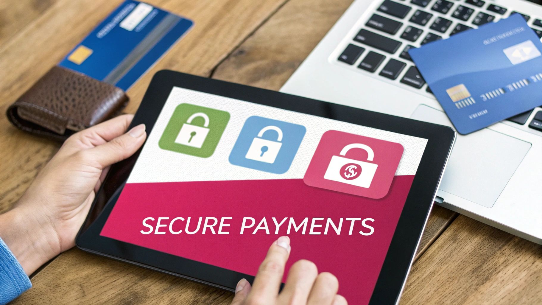
The High Cost of Checkout Friction
Displaying security badges, for example, reassures customers about the safety of their payment information. Offering various payment options, such as credit cards, debit cards, and digital wallets like PayPal, caters to different preferences and further reduces friction. This underscores the importance of optimizing the checkout experience for maximum conversions.
Checkout UX remains a significant challenge. Baymard’s UX benchmark reveals that 65% of leading e-commerce sites have a mediocre (or worse) checkout UX. This is a significant issue, as a well-designed checkout can lead to a 35% increase in conversion rates for large sites. A staggering 70% of online shoppers abandon their purchases during checkout, often due to unnecessary obstacles. Find more detailed statistics here. By streamlining checkout flows and minimizing required fields, businesses can significantly enhance user experience and reduce abandonment rates.
Key Elements of a Positive Checkout Experience
Several factors contribute to a positive checkout experience:
- Clear and concise instructions: Guide customers through each step with simple, easy-to-understand language.
- Minimal form fields: Request only essential information. Avoid unnecessary fields that create friction and increase the likelihood of abandonment.
- Mobile optimization: Ensure your checkout process is responsive and functions seamlessly on all devices. With the increasing popularity of mobile commerce, this is essential.
- Multiple payment options: Offer a variety of payment methods to cater to customer preferences. This can include credit cards, debit cards, digital wallets, and other popular payment gateways.
- Security assurances: Display security badges and utilize secure payment processing to build customer trust and ensure the safety of their financial information. This is especially critical for guest checkouts.
By addressing these key areas, businesses can optimize their checkout flow, significantly impacting their conversion rates, and ultimately boosting revenue and fostering customer loyalty.
Decoding Cart Abandonment: Why Shoppers Really Leave
Understanding why shoppers abandon their carts is crucial for any online business. It’s not just about knowing they leave, but why they choose to exit. This means digging deeper than simple statistics and exploring the psychology behind these decisions. What causes shoppers to instantly leave, and what makes them hesitate? Answering these questions is the key to a better checkout experience and improved sales.
Functional vs. Emotional Barriers
Two main types of barriers lead to cart abandonment: functional and emotional. Functional barriers are concrete roadblocks within the checkout process itself. These can be technical glitches, limited payment methods, or a confusing checkout flow. For example, a website that only accepts credit cards excludes those who prefer using PayPal or other digital wallets.
Emotional barriers, however, are tied to customer feelings and perceptions. This can include a lack of trust in site security, purchase anxiety, or simply uncertainty about the product. Unexpected shipping fees or a complicated return policy are examples that can trigger emotional barriers and lead to cart abandonment. Addressing both functional and emotional barriers is crucial for a positive and successful checkout.
Uncovering the True Motivations
Customer behavior analysis and exit interviews offer deeper insights into why shoppers abandon their carts. These studies reveal the motivations behind these lost sales and pinpoint specific pain points. A long or complex checkout process, for instance, is a major contributor to high abandonment rates, which currently sit around 69%.
By simplifying the checkout and focusing on convenience, businesses can greatly reduce these numbers and improve customer satisfaction. Learn more about a seamless checkout experience here. This also improves customer loyalty and encourages referrals. Furthermore, a better checkout experience can lead to substantial sales growth—some large e-commerce sites have seen up to a 35% increase in conversions. This highlights how crucial checkout design is for driving revenue and building a loyal customer base.
Diagnosing and Addressing Abandonment Patterns
Every business is different, so the reasons for cart abandonment will vary. This requires a system for diagnosing your specific abandonment issues. Tools like analytics dashboards, customer surveys, and A/B testing offer valuable data to understand where and why customers abandon their carts. Read also: Abandoned Cart Recovery Statistics. This information can then guide you toward targeted solutions. Maybe your mobile checkout is underperforming, or your shipping costs are too high. By pinpointing these specific problems, you can tailor solutions and optimize your checkout for maximum conversions.
Streamlining Your Checkout Flow for Maximum Conversions

A well-designed checkout is essential for e-commerce success. It’s the crucial point where browsing becomes buying. This section explores how simplifying your checkout process can significantly increase your conversions.
The Science of Simplification
Imagine a physical store with one incredibly slow checkout line. Customers, frustrated with the wait, abandon their carts and leave. A similar situation happens online with a clunky checkout experience.
This is where checkout optimization comes in. It’s all about removing unnecessary steps and distractions. This could mean simplifying the layout, reducing required fields, offering various payment methods, and making the experience mobile-friendly.
For instance, think about reducing form fields. Collecting customer data is important, but too many fields create friction. Determine the essential information for order processing and remove the rest. This speeds up checkout and reduces customer effort. Clear instructions at each step also help.
The Power of Progress Indicators
Progress indicators are another key element of checkout optimization. These visual cues, like progress bars or numbered steps, tell customers where they are in the checkout process.
This has a powerful psychological effect, reassuring customers and building confidence. Like mile markers on a marathon, progress indicators encourage them to finish. This is especially helpful in multi-step checkouts.
Customers are less likely to abandon their carts if they know how many steps are left. Clear communication and visual progress tracking create a positive experience and boost conversions. Learn more about checkout optimization in this Ecommerce Checkout Optimization Guide for Digital Retailers. Small improvements can make a big difference.
Optimizing Checkout Sequencing
The order of checkout steps also matters. Eye-tracking studies and user testing show where shoppers experience friction. These studies often reveal discrepancies between where businesses think friction exists and where it actually is. For example, unclear shipping options can be more problematic than entering payment information.
Optimizing the sequence based on user behavior is key. A logical flow improves the user experience. Start with essentials like shipping address and delivery method. Then, gradually request more details, ending with payment information.
Checkout optimization is crucial for e-commerce, and it can significantly boost revenue. For instance, Wreaths Across America saw a 63% revenue increase and a 37% increase in conversions after optimizing its checkout. More detailed statistics can be found here. This shows the impact of a streamlined checkout.
To illustrate the impact of checkout optimization, let’s look at some data:
Checkout Optimization Impact
| Metric | Before Optimization | After Optimization | Percentage Change |
|---|---|---|---|
| Cart Abandonment Rate | 70% | 45% | -35.7% |
| Average Order Value | $50 | $55 | +10% |
| Conversion Rate | 3% | 5% | +66.7% |
| Revenue | $10,000 | $17,250 | +72.5% |
This table summarizes the improvements observed after implementing various checkout optimization strategies. The significant drop in cart abandonment, coupled with increased average order value and conversion rate, resulted in a substantial boost in overall revenue. These findings underscore the importance of a streamlined and user-friendly checkout experience in driving e-commerce success.
One-Click Checkout: Implementation That Actually Works
One-click checkout is often praised for its potential to increase sales. However, a successful implementation requires careful planning and execution. This section explores the practical aspects of integrating one-click checkout, examining different approaches and emphasizing the crucial balance between speed and security. We’ll also discuss how to select the right solution for your business.
Platform-Native vs. Third-Party Providers
There are two main ways to implement one-click checkout: using your platform’s built-in features or integrating with a third-party provider. Platform-native options often offer simpler setup and tighter integration with your existing systems. However, they may not have the advanced features and flexibility of a third-party solution.
Third-party providers, such as Stripe, can offer more customization options and specialized tools. These tools can include fraud prevention and subscription management. The best path depends on your technical resources, budget, and specific needs. Some platforms like Shopify offer basic one-click checkout features. Other platforms, like BigCommerce, may require third-party integrations.
Case Studies: One-Click in Action
Looking at how other businesses have implemented one-click checkout can provide valuable lessons. Let’s consider two examples:
- Small Business (Fashion Boutique): This business chose a platform-native solution for its simplicity and lower cost. They were able to quickly implement one-click checkout and improve the experience for returning customers. They saw a noticeable boost in repeat purchases.
- Large Enterprise (Electronics Retailer): This enterprise opted for a third-party provider to access advanced features. Features like address auto-completion and multiple payment options were key. The integration required more technical effort but offered greater flexibility and customization. They saw a substantial decrease in cart abandonment and a higher average order value.
These examples highlight the importance of choosing a solution that fits your business.
Overcoming Implementation Challenges
While one-click checkout seems straightforward, implementation can have its hurdles. Data migration, especially for larger businesses, can be complicated. Integrating with existing payment gateways and maintaining security protocols also presents challenges. It’s also vital to ensure a smooth mobile experience, as more customers shop on their phones. Addressing these challenges requires careful planning, testing, and ongoing refinement.
Improving the checkout process is a top priority for online retailers. A study showed that 78% of U.S. online retailers are working to improve their checkout process, with 55% seeking new features from payment providers. Learn more about these checkout upgrades here. One key area is implementing one-click checkout, requested by 45% of merchants, to streamline the purchasing process and boost conversions.
Balancing Convenience and Security
One-click checkout offers exceptional convenience, but it also raises security concerns. Storing sensitive customer information demands strong security measures. These measures protect against fraud and data breaches. This includes encrypting data, using two-factor authentication, and complying with regulations like PCI DSS. Clearly communicating security practices to customers builds trust and addresses concerns.
Balancing convenience and security is essential for optimizing sales while keeping customer trust. This involves transparency about security measures and giving users control over their data. Offering guest checkout options alongside one-click checkout can cater to users with varying comfort levels. By addressing security concerns head-on, businesses can foster trust and encourage the use of one-click checkout.
Mobile Checkout Mastery: Converting On Small Screens
Mobile commerce is experiencing rapid growth. However, many businesses find it difficult to convert mobile shoppers into paying customers. This often stems from checkout experiences originally designed for desktops and then squeezed onto smaller screens. This can lead to frustrated customers and lost sales. A mobile-first strategy is essential for mastering mobile checkout. This involves optimizing every aspect of the checkout process for the specific requirements of smartphones and tablets. Imagine trying to complete a complicated form on your phone with one hand while on a crowded bus – a truly mobile-optimized checkout avoids this kind of hassle.
Thumb-Friendly Design: Prioritizing One-Handed Use
Many mobile users shop while on the move, often using their phones with just one hand. This highlights the need for thumb-friendly navigation. Interactive elements, such as buttons and form fields, should be easily accessible with a thumb. Strategic placement is crucial, ensuring essential actions fall within the screen’s “thumb zone.” Designing with the average thumb reach in mind significantly improves usability and minimizes accidental clicks.
Touch-target sizing is equally important. Small buttons and links are hard to tap accurately on a touchscreen, increasing errors and user frustration. Larger touch targets reduce these errors. Aim for touch targets at least 44 pixels wide and tall.
Keyboard optimization also streamlines data entry. The correct keyboard type should automatically appear for each field – a numeric keypad for phone numbers and credit card details, for example. This prevents users from manually switching keyboard layouts, making the process smoother.
Reimagining Form Design for Mobile Contexts
Traditional, lengthy scrolling forms become cumbersome on mobile. Collapsible sections or a multi-step checkout can break down the process into smaller, more manageable steps. This reduces the cognitive load on the user, making checkout feel less overwhelming. Minimizing required fields by requesting only essential information (and gathering non-essential details later) further reduces friction.
Input errors often lead to cart abandonment on mobile. Features like auto-fill, address lookups, and input validation prevent errors and expedite the checkout process. Picture filling in your address with a single tap – these small improvements can have a major impact on conversion rates.
To illustrate these best practices, let’s look at a comparison table:
Mobile vs Desktop Checkout Best Practices
This table compares key design and usability considerations for both mobile and desktop checkout experiences.
| Feature | Mobile Best Practice | Desktop Best Practice | Implementation Notes |
|---|---|---|---|
| Navigation | Thumb-friendly design, one-handed use prioritized | Mouse and keyboard navigation | Focus on intuitive placement of elements for each input method |
| Form Design | Collapsible sections, multi-step checkout | Single or multi-page checkout | Prioritize concise forms on mobile, more detailed forms acceptable on desktop |
| Input Fields | Auto-fill, address lookup, input validation | Clear labels, input validation | Minimize required fields on mobile |
| Button Size | Minimum 44 pixels wide and tall | Larger sizes generally preferred | Ensure comfortable tapping on mobile |
| Keyboard | Optimized for input type (numeric, email, etc.) | Standard keyboard | Streamline data entry on mobile |
By comparing mobile and desktop best practices, we can identify key areas for improvement in our mobile checkout flow. Focusing on a streamlined mobile experience is essential for conversions.
Adaptive Checkout Flows for Different Mobile Contexts
Mobile devices and operating systems vary in screen sizes and capabilities. Adaptive checkout flows, which intelligently respond to these differences, are critical for a seamless experience. This means tailoring the layout and functionality to each device, considering the different ways users interact with Android and iOS devices, for instance.
Device-specific optimizations, such as adjusting font sizes, image dimensions, and button placement for various screen resolutions, can drastically improve performance. These adjustments create a more user-friendly experience regardless of the device. Learn more in our guide on How to master mobile checkout optimization. By understanding how mobile users interact with your checkout, you can transform browsing shoppers into paying customers.
Building Unshakable Trust at the Moment of Purchase
The checkout process is a critical moment in the customer journey. It’s where purchase anxieties often peak, and decisions hang in the balance. Nurturing trust at this stage is crucial for converting hesitant shoppers into paying customers. This goes beyond simply displaying security badges; it’s about creating a feeling of confidence and security throughout the entire checkout experience.
The Psychology of Trust Signals
Trust signals are important for easing customer anxieties. However, not all trust signals are equal. Some, like clearly displayed security badges and guarantees, directly affect purchase decisions. Others, while well-intentioned, might create unnecessary distractions. For example, a cluttered checkout page with too many trust badges can overwhelm shoppers and actually reduce conversions.
The key is to strategically place the right trust signals at the right time. Security indicators should be prominent near payment information fields. Satisfaction guarantees can be highlighted near the “purchase” button. Social proof, such as customer testimonials or the number of previous purchases, can build confidence earlier in the checkout flow.
Transparency: A Cornerstone of Trust
Transparency in pricing, shipping, and return policies builds substantial trust. Unexpected costs or complicated return procedures are major contributors to cart abandonment. Clearly showing all costs upfront, including shipping and taxes, eliminates unpleasant surprises. An easy-to-understand return policy, readily accessible during checkout, reassures customers about their purchase. This open communication builds confidence and encourages order completion. Learn more in our article about the role of trust in reducing cart abandonment.
Implementing Trust Without Sacrificing Conversions
Building trust doesn’t require adding clutter. It’s about smoothly incorporating trust-building elements without interrupting the checkout flow. Think of it as a well-designed store: security is present, but it doesn’t interfere with the shopping experience. A clean, organized checkout page with strategically placed trust signals creates a reassuring environment without hindering the purchase process.
For example, a small, recognizable security badge near the credit card field can be more effective than a large, distracting banner. A concisely worded satisfaction guarantee is often more impactful than a long paragraph of legal terms.
Focusing on Key Trust Builders
Here’s a summary of essential trust-building elements for a positive checkout experience:
- Security Indicators: Display recognizable security badges (e.g., SSL certificates, PCI DSS compliance) near payment fields.
- Satisfaction Guarantees: Clearly communicate your return policy and any satisfaction guarantees.
- Social Proof: Include customer testimonials or display the number of successful transactions.
- Transparent Pricing: Show all costs upfront, including shipping, taxes, and any other applicable fees.
- Clear Return Policy: Provide a link to an easy-to-understand return policy.
By focusing on these key elements, you can create a checkout experience that fosters trust, reduces anxiety, and ultimately increases conversions. You might also be interested in: How to master reducing checkout abandonment. This resource can further optimize your checkout process and minimize lost sales.
Creating Checkout Experiences That Build Customer Loyalty
The checkout experience isn’t simply about processing transactions; it’s a crucial touchpoint for building strong customer relationships. A seamless and positive checkout can transform a first-time buyer into a loyal brand advocate. This leads to repeat business, positive word-of-mouth referrals, and ultimately, sustainable growth.
The Post-Purchase Power of a Smooth Checkout
Examining customer behavior after a purchase offers valuable data about the long-term effectiveness of your checkout process. For example, a customer who easily completes a mobile-optimized checkout is more likely to make future purchases on their phone. Clear communication regarding shipping costs and estimated delivery times during checkout reduces post-purchase anxiety and encourages positive reviews. This highlights the direct link between a smooth checkout and increased customer lifetime value.
Gathering Customer Insights (Responsibly)
Successful businesses use the checkout process to gather valuable customer data, but they do so ethically and transparently. Asking for feedback after the purchase, not during the checkout flow, shows respect for the customer’s time. Offering opt-in choices for personalized recommendations demonstrates respect for customer privacy and builds trust. This careful approach strengthens customer relationships and prevents alienating potential repeat customers.
Personalization That Enhances, Not Distracts
Personalization in the checkout experience is more than just using the customer’s name. It’s about using data to provide real value. For example, suggesting related items during checkout for customers who have previously purchased a specific product can enhance their shopping journey. Offering preferred payment methods based on past transactions makes the checkout process faster and easier. This type of thoughtful personalization builds customer loyalty by making them feel valued and understood. Consumers highly value convenience, with 50% factoring the checkout process into their purchasing decisions. A hassle-free experience attracts new customers and boosts competitiveness. Find more statistics here.
Continuous Checkout Improvement
The checkout process is an ongoing project, not a destination. Continuous improvement based on testing and customer feedback is vital. A/B testing different checkout layouts, reviewing customer feedback from surveys, and monitoring key metrics like cart abandonment rates provide crucial information for ongoing optimization. This iterative method keeps your checkout experience aligned with evolving customer expectations. Learn more about optimizing your checkout in our guide on How to Reduce Checkout Abandonment.
Ready to turn abandoned carts into sales and cultivate lasting customer loyalty? CartBoss offers a robust SMS marketing platform to re-engage customers and recover lost revenue. Automated campaigns, personalized messaging, and seamless integration with popular e-commerce platforms make winning back lost customers easy. Visit CartBoss today to learn more and start maximizing your profits.