
If you want to turn more of your website visitors into paying customers, you have to get systematic. The goal is to hunt down every friction point in the user journey and smooth it out, making it dead simple for people to do what you want them to do—whether that’s buying a product or signing up. This isn’t about guesswork; it’s about deep, honest analysis.
Establishing Your Conversion Baseline
Before you can even think about improving your conversion rates, you need a crystal-clear picture of where you stand right now. This means going way beyond vanity metrics like traffic and digging into the data that tells the real story of how users behave on your site. Without a solid baseline, any changes you make are just shots in the dark.
This initial audit is all about gathering actionable intelligence. Where are people dropping off? Which pages are sending them running for the exit? Are your mobile visitors converting at a lower rate than desktop users? The answers to these questions are the first real step toward meaningful optimization.
Finding Your Starting Point With Analytics
Your analytics platform—something like Google Analytics—is your command center for this mission. It holds all the clues you need to figure out why visitors aren’t converting. By setting up conversion goals and looking at user flow reports, you can pinpoint the exact spots where your funnel is leaking cash.
For example, an e-commerce store might dig in and find that while thousands of users add products to their cart, a shocking 70% of them bail before actually paying. That data immediately tells them the problem isn’t the product or the marketing—it’s something funky happening in the checkout experience.
Here’s a glimpse of what a conversion goals overview might look like in Google Analytics.
A dashboard like this gives you that high-level view of goal completions, value, and conversion rates, helping you quickly spot trends and problem areas that need a closer look.
To get the full picture, it’s essential to track a few core metrics. These numbers will form the foundation of your entire CRO strategy, telling you what’s working and what’s breaking.
Key Metrics for Your Conversion Rate Audit
Here’s a breakdown of the must-watch metrics when you’re establishing your website’s baseline performance.
| Metric | What It Measures | Why It Matters for CRO |
|---|---|---|
| Overall Conversion Rate | The percentage of visitors who complete a desired action (e.g., purchase, sign-up). | This is your main KPI. It gives you a top-level view of your site’s effectiveness. |
| Bounce Rate | The percentage of visitors who leave your site after viewing only one page. | A high bounce rate on key pages (like product or landing pages) signals a major disconnect with user intent. |
| Exit Rate | The percentage of visitors who leave from a specific page, even if it wasn’t their first page. | High exit rates on checkout or cart pages are huge red flags that point to friction or trust issues. |
| Average Session Duration | The average amount of time users spend on your site during a single visit. | Low duration can indicate a lack of engagement or that users can’t find what they’re looking for. |
| Cart Abandonment Rate | The percentage of users who add items to their cart but don’t complete the purchase. | This metric directly highlights problems in your checkout flow—hidden fees, complex forms, etc. |
Tracking these metrics isn’t a one-time thing. It’s an ongoing process that helps you measure the real impact of every change you make.
Understanding Industry Benchmarks
Knowing your own numbers is absolutely critical, but you also need context. The average website conversion rate often hovers around 2.35% to 2.8% globally, but that number swings wildly depending on your industry and where your traffic is coming from. In the U.S., for instance, e-commerce sites converted at about 2.58% in late 2023. The real top-performers are often pushing their rates to 3% to 5% or even higher.
The goal isn’t just to meet the average; it’s to understand where you stand so you can set realistic, incremental goals. If your rate is 1%, getting it to 1.5% is a massive win.
By comparing your performance to industry standards, you can get a much better feel for your potential. For a deeper dive, you can explore detailed ecommerce conversion rate benchmarks that break down performance by industry and business size, giving you a clearer target to aim for. This foundational data gives your entire CRO strategy direction and a real purpose.
Building Trust to Overcome User Hesitation

Trust is the invisible currency of the internet. A visitor can absolutely love your product, but if they feel even a hint of uncertainty, they’ll hesitate. And a hesitant visitor almost always leaves.
Building credibility isn’t about some grand, sweeping gesture. It’s about systematically removing every ounce of friction and anxiety from the user experience, one small signal at a time.
Picture someone hovering over the “Buy Now” button, credit card in hand. What’s stopping them? It could be anything—a missing security seal, a confusing return policy, or just a gut feeling that something’s off. Your job is to get ahead of these hesitations and proactively address them with clear, reassuring trust signals.
Showcase Authentic Social Proof
One of the most powerful tools in your arsenal is social proof. When potential customers see that real people have bought from you and had a great experience, their skepticism naturally starts to fade. This is about more than just slapping a few five-star ratings on a page and calling it a day.
For social proof to work, it has to feel genuine and be placed where it matters most.
- Customer Testimonials: Feature quotes from real customers that get specific. Instead of a generic “Great product!”, use a testimonial that says, “The setup was incredibly easy, and I saw results in the first week.” That’s a story, not just a rating.
- User-Generated Content: Encourage customers to share photos or videos of them using your product. Nothing is more convincing than seeing your product out in the wild, being used by someone just like them. It’s far more compelling than polished marketing shots.
- Case Studies: For more complex products or services, detailed case studies showing a clear before-and-after transformation are incredibly persuasive.
Display Clear Trust Signals
Beyond reviews, several visual cues can instantly make your site feel more secure and professional. These signals work on a subconscious level, assuring visitors that their information is safe and that your business is legitimate.
Trust signals aren’t just decorative elements; they are active conversion tools. When a user feels secure, their path to purchase becomes frictionless, directly impacting your bottom line.
The data backs this up. Simple trust signals like security badges and testimonials can lift conversion rates by about 32%. On top of that, social proof elements like customer reviews have been shown to drive a 34% increase in conversions, making them non-negotiable for any serious CRO strategy.
Here are the key signals you should implement:
- Security Badges: Display well-known security seals (like Norton or McAfee) prominently during your checkout process. Don’t make people hunt for them.
- Payment Logos: Show the logos of accepted payment methods like Visa, Mastercard, and PayPal. This signals legitimacy and convenience at a glance.
- Clear Policies: Your return policy, shipping information, and privacy policy should be ridiculously easy to find and understand. Hiding this information is an immediate red flag and creates distrust.
Ultimately, understanding the role of trust in reducing cart abandonment is fundamental. Each trust signal you add is another reason for a user to complete their purchase with total confidence.
Crafting Compelling Calls to Action and Landing Pages

So you’ve done the hard work and built a foundation of trust with your visitors. What now? Now you have to guide them to a decision. This is where your landing pages and call-to-action (CTA) buttons come into play—they’re the final gateways to conversion.
This is the moment where a visitor’s interest turns into concrete action, so every single element has to work in harmony to make that choice feel obvious and easy.
A weak CTA is a dead end. Vague, passive words like “Submit” or “Continue” do nothing to inspire action because they don’t communicate any real value. Instead, they create friction and uncertainty. What happens when I submit? Where do I continue to? This tiny moment of hesitation is often all it takes for a user to bounce.
Designing CTAs That Demand a Click
A truly effective call to action does more than just ask for a click; it promises a clear, desirable outcome. The secret is to use action-oriented language that perfectly mirrors what the user wants to achieve. Think about what the visitor gets, not what they have to do.
For instance, ditch the generic “Download.” Instead, try “Get My Free Ebook.” The second option is specific, personal, and immediately highlights the benefit—it’s free. This small psychological shift can make a huge difference in your click-through rates.
Here are a few principles I always follow for creating CTAs that convert:
- Use Action Verbs: Start with a strong verb that tells users exactly what to do. Words like “Get,” “Start,” “Join,” or “Try” are far more compelling than their sleepy, passive alternatives.
- Create Visual Contrast: Your CTA button should be impossible to miss. Use a color that pops against the rest of the page’s palette. If your site is mostly blue and white, a bright orange or green button will immediately draw the eye.
- Keep It Concise: The button copy needs to be short and punchy. Aim for 2-5 words that clearly and quickly articulate the value.
A great CTA answers the user’s silent question: “What’s in it for me?” By focusing on the benefit, you align your goals with theirs, making the decision to click a natural next step.
Enhancing Landing Pages for Maximum Impact
Think of your landing page as the supporting actor to your CTA’s leading role. Its entire purpose is to reinforce the value promised in your ad or link and build momentum toward that final click. A cluttered or confusing page will sabotage even the most brilliantly designed button.
One of the best ways I’ve seen to boost engagement on a landing page is by incorporating dynamic content. Websites using clear, prominent CTA buttons can see conversion rates around 17.85%, but adding video can push that number even higher. In fact, including a short, engaging video on a landing page can increase conversions by as much as 86%.
A powerful, yet simple, strategy is to align your page’s headline directly with the CTA. If your CTA is “Start Your Free Trial,” the headline should scream “Begin Your Risk-Free 14-Day Trial Today.” This creates a seamless, logical flow that erases any doubt from the user’s mind.
If you’re looking to dive deeper into page design, our guide on how to optimize landing pages is packed with more advanced techniques.
Streamlining Your Final Conversion Path
This is it. The final steps of the customer journey are by far the most fragile. A shopper can love your brand, trust your products, and still bail at the last possible moment. In the checkout, tiny friction points become massive conversion killers.
Optimizing your checkout process isn’t just a minor tweak; it’s a critical strategy. It’s all about methodically removing every single obstacle that stands between your customer’s “I want this” moment and a completed purchase.
Eliminate Unpleasant Surprises
Let’s cut to the chase: the number one reason for cart abandonment is unexpected costs. A customer has mentally agreed to a price, and then—bam—they get blindsided by high shipping fees or taxes on the final screen. This shatters trust and sends them running to find a better deal.
Cost transparency is completely non-negotiable. Research consistently shows that hidden costs are the primary driver of abandoned carts. Sites that hide costs until the very end often see their conversion rates stall around a measly 2%. In contrast, stores that prioritize transparency from the start can push conversions north of 3%.
To get this right, you need to tackle those hidden fees head-on.
- Offer Free Shipping: If you can, bake the shipping cost into your product price. “Free shipping” is one of the most powerful psychological triggers in ecommerce.
- Use a Shipping Calculator: Don’t make them wait. Let users estimate shipping costs early in the process, like on the product or cart page.
- Show All-Inclusive Pricing: Be upfront. Display the final price, including taxes and fees, as early and as clearly as possible.
Simplify the Path to Purchase
Every single field a user has to fill out is another chance for them to give up and leave. Your goal is to make checking out feel effortless and fast.
A classic example of unnecessary friction is mandatory account creation. Countless stores have recovered 15% or more of their abandoned carts just by adding a guest checkout option. It’s a simple change with a huge impact.
A seamless checkout is an invisible one. The less a customer has to think about the process, the more likely they are to complete it.
Focus on stripping your forms down to the absolute essentials. Do you really need their phone number right now? Can you use autofill to populate their address? Each simplification makes a tangible difference. For a deeper dive, check out our ecommerce checkout optimization guide for digital retailers.
Finally, offer a variety of payment options. Limiting choices to just credit cards can alienate a huge chunk of your audience who prefer digital wallets like PayPal, Apple Pay, or Google Pay. Providing these one-click options caters to modern buying habits and drastically cuts down the effort needed to hit “complete purchase.”
Building A Cycle Of Continuous Improvement
Getting your conversion rates up isn’t a one-and-done project. It’s not a finish line you cross. The brands that really crush it treat conversion optimization as a constant loop of learning, testing, and tweaking. This is how you move away from making changes based on gut feelings and start building a culture where data calls the shots.
The engine driving this whole process is systematic testing, usually through A/B testing (or split testing). You create two versions of a page—the original “control” (Version A) and your new idea (Version B). Then, you show them to different groups of visitors to see which one performs better. It’s the most reliable way to get straight answers about what actually works for your audience.
Forming a Strong Hypothesis
Every valuable test starts with a strong hypothesis, not just a random “let’s try this” idea. A proper hypothesis is really an educated guess based on the data you’ve already pulled from your website audit. It should follow a simple but powerful structure: “If I change [X], then [Y] will happen because of [Z].”
Let’s say your analytics are screaming that people are bailing on your product pages. A weak idea is “maybe add a video?” A strong hypothesis sounds like this: “If we replace the static product images with a short demo video, then add-to-cart clicks will increase because users will finally understand the product’s value and feel more confident hitting that button.” See the difference? It’s specific, you can measure it, and it’s tied directly to a real user problem you’ve identified.
A well-formed hypothesis turns a vague idea into a testable experiment. It forces you to articulate the why behind your proposed change, connecting your action directly to an expected outcome and a user behavior insight.
This is where you can get really strategic. For instance, think about how you use social proof. It’s not a one-size-fits-all tool.
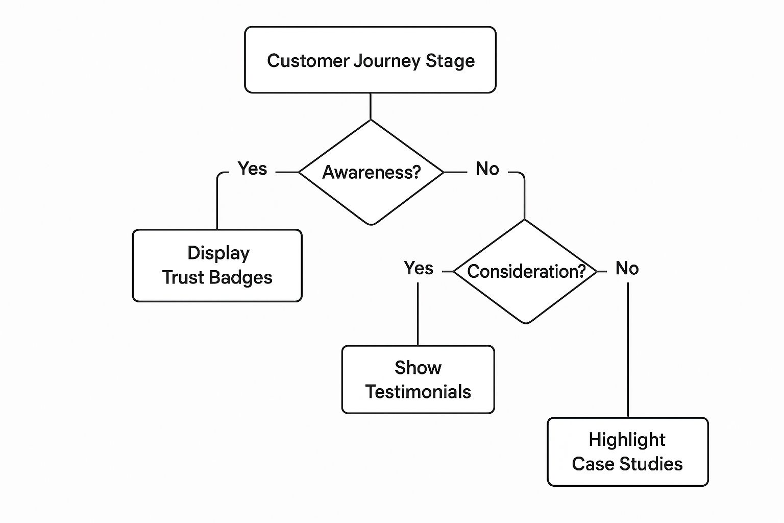
The image above shows how to match your trust signals to where the user is in their journey. You wouldn’t use a massive case study on someone just browsing, but a quick testimonial? Perfect. This kind of targeted thinking leads to much stronger hypotheses.
Prioritizing Your Tests for Maximum Impact
You’re going to have a ton of ideas for tests. That’s a good thing! But you can’t run them all at once. The secret is to prioritize the ideas that promise the biggest bang for your buck. You need to weigh two simple things:
- Potential Impact: How much could this realistically move the needle on your main conversion goal? Changing a button color might give you a tiny lift, but rewriting your main value proposition on the homepage could be a game-changer.
- Implementation Effort: How much developer time, design work, and general hassle will this test require? Swapping out an image is usually easy. A full checkout redesign is a major project.
To make this process less of a guessing game, I recommend a simple framework to score your ideas. This helps you focus on the low-effort, high-impact winners first.
A/B Testing Idea Prioritization Framework
| Test Idea (Example) | Potential Impact (1-5) | Implementation Effort (1-5) | Priority Score (Impact/Effort) |
|---|---|---|---|
| Change CTA button color from blue to orange | 2 | 1 | 2.0 |
| Add customer testimonials below “Add to Cart” | 4 | 2 | 2.0 |
| Replace product photo carousel with a demo video | 5 | 3 | 1.7 |
| Redesign the entire product page layout | 5 | 5 | 1.0 |
| Simplify checkout form from 6 fields to 3 | 4 | 4 | 1.0 |
Looking at the table, changing the CTA color and adding testimonials are both high-priority tests because they offer a good potential return for relatively little work. The full redesign, while potentially impactful, is a huge effort and should probably wait.
It’s also crucial to document every single test result, especially the ones that fail. A “failed” test is never a waste of time. It’s a priceless piece of information that tells you what doesn’t resonate with your audience.
Over time, this library of insights becomes your secret weapon. It fuels a smarter, more effective strategy for continuous conversion funnel optimization. This feedback loop is what transforms your site from a static brochure into a dynamic conversion machine that gets better every single month.
Got Questions About CRO? We’ve Got Answers.
As you start digging into conversion rate optimization, you’re bound to have some questions pop up. That’s a good thing. It means you’re thinking critically about what works. This whole process is a cycle of testing, learning, and tweaking.
Let’s clear up a few of the most common questions we hear from people just like you.
What Is a Good Website Conversion Rate?
Honestly, defining a “good” conversion rate is like asking “how long is a piece of string?” It’s completely relative. What’s fantastic for one business could be a disaster for another.
Your industry, price point, business model, and even where your traffic is coming from all play a huge role. You’ll often hear people throw around a global average of 2% to 3%, but you shouldn’t treat that as a universal benchmark. It’s just an average, after all.
Think about it: a high-end B2B company selling six-figure software might celebrate a 1% conversion rate. On the flip side, a trendy t-shirt store running a killer TikTok ad campaign might be aiming for 5% or more.
The only benchmark that truly matters is your own. Your goal shouldn’t be to hit some arbitrary industry number, but to consistently beat your past performance. A steady climb from 1.5% to 2% is a real win.
How Long Should an A/B Test Run?
There’s no magic number here. The right duration for an A/B test depends entirely on your site’s traffic and how much of an impact you expect your change to make. The main goal is to reach statistical significance—usually a 95% confidence level—so you know the results aren’t just a fluke.
For most sites, you’re looking at a minimum of two full weeks. This helps smooth out any weird fluctuations that happen on different days of the week (think weekend shoppers vs. weekday researchers).
A classic mistake is to call a test early just because one version jumps out to an early lead. That’s a great way to make a bad decision based on incomplete data. Patience is your best friend here.
Where Should I Start With a Limited Budget?
Working with a tight budget? No problem. It just means you have to be smarter about where you focus your energy. Forget about fancy, expensive tools for now.
Start with the free stuff. Dive into your Google Analytics and find the pages with the highest exit rates or the biggest drop-offs in your funnel. These are your money leaks.
Once you’ve identified the problem areas, focus on high-impact changes that don’t cost a dime:
- Sharpen Your Value Prop: Does your headline immediately scream “this is what’s in it for you”? If not, rewrite it until it does.
- Fix Your Main CTA: Test new copy, different colors, or a new spot on the page for your most important call-to-action button. This is a five-minute change that can have a massive impact.
- Add Real Social Proof: Sprinkle in some genuine customer reviews or testimonials right next to your “buy” or “sign up” buttons. It builds instant trust.
These simple, foundational tweaks can reduce friction and build confidence without you ever having to pull out your credit card. They’ll set you up perfectly for more advanced testing when you’re ready.
Ready to stop losing sales to abandoned carts? CartBoss turns those lost opportunities into profit with automated SMS campaigns that bring customers back. Recover lost revenue and boost your sales on autopilot. Start recovering carts with CartBoss today.