
Analyzing sales data is so much more than just crunching numbers. It’s about transforming raw data into a clear story that actually helps you make smarter business decisions, like figuring out your most profitable customer groups or smoothing out your sales funnel.
Why Modern Sales Analysis Is More Than Numbers

Before you even think about building a chart, you need to understand what sales analysis really means today. It’s no longer about simply tracking monthly revenue or checking if your team hit its quota. Real analysis is about digging into the story behind the sale—the ‘who,’ ‘what,’ ‘why,’ and ‘how’ that drive your business forward.
Getting this foundation right is what turns a pile of data into strategic decisions that actually move the needle. It all starts with asking the right questions.
To get a clearer picture of the entire process, it’s helpful to break it down into its core components. Each stage builds on the last, turning raw information into actionable strategy.
This table outlines the essential pillars of a successful sales data analysis project.
Core Components of Sales Data Analysis
| Component | Objective | Key Activities |
|---|---|---|
| Goal Definition | Establish clear, specific questions to answer. | Identify KPIs, define success metrics, align with business strategy. |
| Data Collection | Gather raw data from all relevant sources. | Integrate CRM, transaction logs, web analytics, customer feedback. |
| Data Cleaning | Ensure data accuracy and consistency. | Remove duplicates, correct errors, handle missing values. |
| Data Analysis | Apply techniques to uncover patterns and trends. | Segment data, identify correlations, perform regression analysis. |
| Data Visualization | Present findings in an understandable format. | Create charts, graphs, dashboards, and reports. |
| Interpretation | Translate findings into actionable insights. | Develop recommendations, formulate strategies, forecast outcomes. |
Ultimately, the journey from a simple question to a data-driven strategy relies on executing each of these steps thoughtfully.
Defining Your Core Objectives
The absolute first step in any meaningful analysis is deciding what you want to achieve. Without a clear goal, you’re just wandering through a sea of metrics, hoping to find something interesting. Your objectives are your compass.
Here are a few common goals I see businesses focus on:
- Identifying Profitable Segments: Pinpointing which customer groups, products, or regions bring in the most revenue and profit. For a deeper look, check out our guide on how to segment customers.
- Optimizing the Sales Process: Finding the friction points in your sales cycle where deals stall or fall through.
- Improving Forecast Accuracy: Using historical data to make better predictions about future sales, which helps with resource planning.
- Enhancing Team Performance: Looking at individual and team metrics to offer targeted coaching and celebrate top performers.
The real win is moving from reactive reporting (“what happened last month?”) to proactive strategy (“what can we do to win next month?”). That shift only happens when you start with a clear, business-focused question.
Understanding Your Data Sources
Good analysis depends on pulling information from multiple places to build a complete picture. Each data source offers a unique piece of the puzzle.
You’ll likely be working with a few of these:
- Customer Relationship Management (CRM) Systems: This is your goldmine. It holds everything from lead sources and deal stages to customer interactions and sales rep activities.
- Transactional Data: This lives in your eCommerce platform or POS system and includes things like order values, product SKUs, purchase dates, and discount codes.
- Website Analytics: Tools like Google Analytics give you crucial context on customer behavior, showing which marketing channels are actually driving traffic and sales.
- Customer Feedback: Don’t forget qualitative data! Surveys, reviews, and support tickets tell you a lot about customer satisfaction and pain points.
The modern retail world, especially online, generates a staggering amount of this data. Think about it: there are expected to be 2.77 billion online shoppers globally by 2025, with eCommerce sales projected to blow past $6.8 trillion.
This just underscores why your analysis has to be ready to handle huge amounts of information from potentially millions of stores. By getting your goals straight and knowing where your data comes from, you set the stage for an analysis that delivers real business value—not just another spreadsheet.
Gathering and Preparing Your Sales Data
Before you can pull a single insight from your sales numbers, you have to get your hands dirty. The most sophisticated analysis in the world will fall flat if it’s built on messy, incomplete, or just plain wrong data. This initial prep phase isn’t glamorous, but trust me, it’s the most critical part of the entire process.
Think of it this way: you wouldn’t try to cook a gourmet meal with spoiled ingredients. Your data is no different. It needs to be fresh, clean, and organized before you can turn it into business intelligence that actually drives decisions. The whole point here is to create a single source of truth you can rely on completely.
Unifying Your Disparate Data Sources
Your sales data probably doesn’t live in one neat little box. It’s almost always scattered across different platforms, with each one holding a small piece of the customer story. Your first job is to bring it all together.
You’ll likely be pulling from a few common places:
- CRM Platform: This is your home base for customer interactions, deal stages, and sales rep activity.
- E-commerce or POS Systems: Here’s where you’ll find the hard numbers—transactional data like order values, products purchased, and payment methods.
- Marketing Analytics Tools: Platforms like Google Analytics are gold for connecting marketing campaigns directly to sales.
- Customer Support Software: Don’t overlook this one. Support tickets and chats often contain the why behind customer churn or satisfaction.
Bringing these sources together isn’t just a copy-paste job; it’s about connecting the dots. For example, linking a customer’s purchase history from your Shopify store to their support tickets in Zendesk can suddenly reveal why your highest-value customers are churning. This unified view is where the real “aha!” moments start to happen.
The Essential Data Cleaning Checklist
Once all your data is in one place, the real cleanup begins. This is where you methodically hunt down and fix all the little errors that could send your analysis completely off course. It requires a sharp eye.
A rookie mistake is to rush through the cleaning. Always remember the “garbage in, garbage out” rule. I’ve seen teams miscalculate regional sales by thousands of dollars just because they didn’t take an hour to standardize state abbreviations.
This workflow is a great way to visualize the core steps for getting your data analysis-ready.
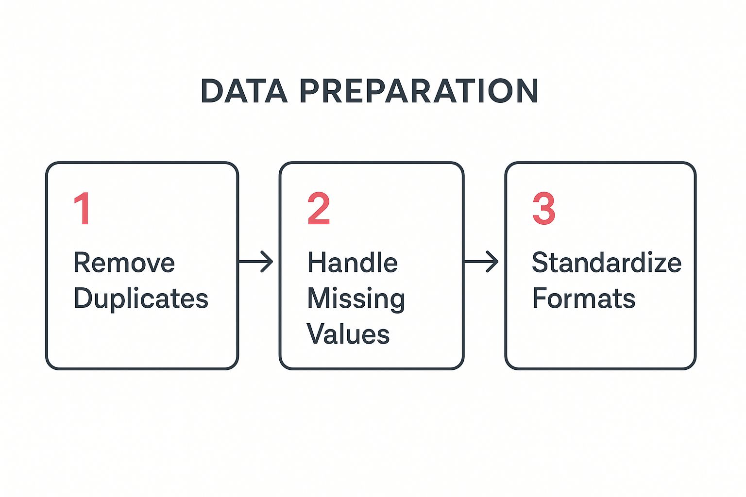
Let’s break down what this actually looks like with some real-world examples:
- Removing Duplicates: Imagine “John Smith” is in your CRM twice—once from a webinar signup and again from a direct purchase. If you don’t merge those records, you’ll miscalculate customer lifetime value and completely underestimate the ROI of that webinar.
- Handling Missing Values: A sales rep forgets to log the lead source for a big deal. You can’t just leave that field blank. You need a consistent approach: either fill it with a placeholder like “Unknown” or, even better, use other data points (like first-touch attribution from web analytics) to make an educated guess.
- Standardizing Formats: This is a classic one. Your data has “CA,” “Calif.,” and “California” all referring to the same state. You have to pick one format (like “CA”) and stick to it, otherwise, any analysis of regional sales will be flawed. The same goes for product SKUs with typos or date formats that vary across systems (MM/DD/YYYY vs. DD-MM-YY).
These small fixes are what make a dataset trustworthy. Once your data is clean and reliable, you’re ready for the fun part: using tools to bring those numbers to life and tell a story.
Choosing the Right Analysis Techniques

Once your data is clean and organized, the real fun begins. You can finally start digging in and asking the questions that will actually move the needle for your business. This is where you shift from just collecting numbers to uncovering the stories they tell.
But you can’t just throw any random analysis at your data and hope for the best. Think of it like a detective’s toolkit—you wouldn’t dust for fingerprints with a crowbar. Picking the right technique for the job is everything.
Start With What Happened: Descriptive Analysis
The best place to start is almost always with descriptive analysis. This is all about looking at your historical data to get a clear picture of what has already happened. It’s the foundation for everything else, giving you a baseline snapshot of your sales performance.
You’re probably already doing this without even calling it that. It’s the day-to-day stuff that keeps you in the loop.
- Tracking Key Performance Indicators (KPIs): This is just monitoring the core metrics that matter to your business. For an eCommerce store, that means things like Average Order Value (AOV), Customer Lifetime Value (CLV), and Cart Abandonment Rate.
- Sales Reporting: Think simple reports like total sales by region, your top-selling products, or a leaderboard showing which sales reps are crushing it.
- Customer Segmentation: This is where you group customers by things they have in common—like what they bought, where they live, or how they found you—to see which groups are your real VIPs.
Getting this right gives you a solid handle on your sales landscape. If you’re wondering what to track, we’ve put together a full guide on the most important ecommerce metrics to track.
Understand Why It Happened: Diagnostic Analysis
After you know what happened, the next logical question is why. That’s where diagnostic analysis comes in. It’s about digging deeper into the data to find the root cause behind a particular spike or dip. You’re moving from just seeing the numbers to actually understanding them.
Let’s say your descriptive analysis shows sales for one of your best-selling products suddenly dropped by 30% last month. Instead of just shrugging, you use diagnostic analysis to figure out why. Did you recently increase the price? Did a competitor launch a big sale? Did a recent update to your checkout page break something?
By comparing the underperforming product’s data against other products or historical trends, you can isolate the variables that changed. This transforms a vague problem (“sales are down”) into a specific, solvable issue (“sales dropped after we removed the free shipping offer”).
Predict What Will Happen: Predictive Analysis
Okay, now we’re shifting from looking in the rearview mirror to looking at the road ahead. Predictive analysis uses your past data, a bit of statistical magic, and machine learning to forecast what’s likely to happen next. This is how you start making proactive decisions instead of constantly reacting to what’s already happened.
Here are a few ways this plays out in the real world:
- Sales Forecasting: Using historical sales cycles and seasonal trends to get a pretty good idea of future revenue.
- Lead Scoring: Figuring out which leads are most likely to actually buy from you based on their behavior and who they are.
- Churn Prediction: Identifying customers who are at risk of leaving so you can step in with a retention campaign before they’re gone.
With the sheer volume of data we have today, these predictions are getting scarily accurate. It’s expected that by 2025, the world will generate 97.2 zettabytes (ZB) of data. Luckily, modern tools handle a lot of the heavy lifting, making this kind of analysis more accessible than ever.
Recommend the Next Best Action: Prescriptive Analysis
Finally, we get to the most powerful level: prescriptive analysis. This takes prediction and kicks it up a notch by telling you exactly what you should do to get the outcome you want. If predictive analysis says “this might happen,” prescriptive analysis says “do this, and that will happen.”
Imagine your predictive model flags a group of customers who are likely to churn. A prescriptive model doesn’t just stop there; it might recommend the perfect intervention—like offering a specific discount, sending a personalized “we miss you” email, or even triggering a task for a sales rep to call them. It helps answer the million-dollar questions, like, “What’s the absolute best offer I can make to this specific customer to maximize their lifetime value?”
Visualizing Data to Tell a Compelling Story
Your analysis is only as powerful as your ability to communicate it. Let’s be honest, raw numbers and dense spreadsheets don’t exactly get people excited. But a sharp, clear visual? That can change minds and drive real strategy. This is where you translate all that hard work into a story that clicks with everyone, from the sales reps on the front lines to the execs in the boardroom.
The point isn’t just to make your data look pretty. It’s about making it instantly understandable. A well-designed chart cuts through the noise and shines a spotlight on the key message, turning a complex finding into a simple, persuasive takeaway. You’re literally guiding your audience’s eyes to the most important conclusion.
Choosing the Right Chart for Your Sales Data
Picking the right type of visualization is absolutely crucial. Using the wrong chart is like trying to tell a joke in a language your audience doesn’t understand—the punchline gets completely lost. Every chart type has a specific job to do.
Think of it like this: you wouldn’t use a hammer to saw a board in half. In the same way, you shouldn’t use a pie chart to show a trend over time. Each one is a tool for a specific task.
So, how do you pick the right one? I’ve put together a quick guide to help you match your goal to the most effective visual format.
Choosing the Right Chart for Your Sales Data
| Analytical Goal | Recommended Chart Type | Best Use Case Example |
|---|---|---|
| Comparing values across categories | Bar Chart (Vertical or Horizontal) | Comparing sales performance across different regions or sales reps for the last quarter. |
| Showing a trend over time | Line Chart | Tracking month-over-month revenue growth or website traffic over the past year. |
| Understanding the relationship between two variables | Scatter Plot | Investigating if there’s a correlation between customer ad spend and their lifetime value. |
| Illustrating parts of a whole | Pie Chart or Stacked Bar Chart | Showing the percentage breakdown of sales revenue by product category. Use sparingly. |
| Visualizing performance against a target | Gauge or Bullet Chart | Displaying a sales team’s progress toward their quarterly quota in a dashboard. |
| Mapping geographical data | Heat Map or Filled Map | Identifying which states or countries are generating the most sales leads. |
When you start with a clear purpose—like, “I need to compare sales in these five regions”—you can confidently grab the chart that will tell that specific story most effectively.
Designing Dashboards That Drive Action
A sales dashboard is much more than a collection of charts. It’s a living, breathing snapshot of your business’s health. A great dashboard lets stakeholders see performance at a glance and drill down into the nitty-gritty when something catches their eye.
When you’re building one, keep it clean and simple. Don’t try to cram every piece of data you have into one view. Instead, organize it logically around key business questions.
Here are a few principles I always follow for effective dashboard design:
- Prioritize Key Metrics: Put your most important KPIs, like Lead Conversion Rate or Customer Acquisition Cost (CAC), at the top left. That’s where the eye naturally goes first.
- Keep It Clean: Stick to a consistent color scheme and avoid clutter. Too many flashy colors or unnecessary decorations just distract from the data itself.
- Provide Context: A number like “150 new leads” is meaningless on its own. Give it context by comparing it to the previous period (up 20% from last month) or the target (75% of goal).
Your dashboard should answer critical business questions in seconds. If someone has to spend more than a minute trying to figure out what they’re looking at, the design has failed. The goal is clarity, not complexity.
Ultimately, a dashboard should empower your team to act. For example, if you spot a dip in your lead-to-customer conversion rate, that’s an immediate signal to investigate the cause. You can find some practical strategies in our guide on improving your sales conversion rate. This is how visualization leads directly to action. It flags problems and highlights opportunities, turning your analysis from a static report into a dynamic tool for growth.
Turning Your Analysis Into Actionable Strategy

This is where all the number-crunching pays off. It’s one thing to uncover a cool pattern in your sales data, but it’s another thing entirely to turn that into a strategy that actually makes you money. The final—and most important—step is connecting the dots between your analysis and real-world business goals.
Let’s be honest: an insight without action is just trivia. Your objective is to stop just presenting data and start recommending clear, data-backed next steps. This is how sales analysis stops being a boring quarterly report and becomes the engine for real growth.
From Insights to Initiatives
You might find a dozen interesting things in your data, but not all of them need your immediate attention. You have to be ruthless about prioritizing. Focus on the insights that could have the biggest impact on your main business goals.
Let’s say you discover a huge drop-off right after someone schedules a demo. That’s not just an observation; it’s a flashing red light. It forces you to ask the right questions. Is our scheduling process a pain to use? Are reps too slow to follow up? Is the copy on the booking page confusing?
Your data points you to the fire. Your strategy is the fire extinguisher.
- Data-Backed Initiative 1: Set up an automated SMS reminder system for demos to cut down on no-shows.
- Data-Backed Initiative 2: A/B test the call-to-action on the demo request page. Does different wording get more people to book?
- Data-Backed Initiative 3: Track rep response times. Is there a direct link between follow-up speed and demos that actually happen?
See how that works? You’ve connected a specific data point (funnel drop-off) to a handful of measurable actions.
Crafting a Compelling Narrative for Stakeholders
You get the data. But your CEO or Head of Marketing doesn’t have time to wade through spreadsheets. Your job is to tell a story that’s both compelling and dead simple to understand. When you present your findings, don’t lead with how you found it; lead with so what.
Structure your presentations and reports around recommendations, not just charts.
A classic mistake is showing a dozen charts and ending with, “…so, that’s the data.” The pros end with, “…and based on this, here are the three things we need to do next week to boost sales by 15%.”
Always frame your findings in terms of business impact. Instead of saying, “Customer segment B has a 25% higher open rate,” try this: “If we focus our next campaign on customer segment B, we could generate an estimated $50,000 in new revenue, based on their proven engagement.” Now you’re speaking their language.
Aligning Strategy with Modern Buyer Behavior
Your strategies can’t be stuck in the past; they have to reflect how people actually buy things today. The old-school sales model is changing fast. Buyers are doing their own homework and are more informed than ever before.
Recent data shows B2B deals now involve an average of 7.4 decision-makers, and buyers often get through 70% of their research before even talking to a salesperson. In fact, a whopping 75% of B2B buyers would rather not talk to a rep at all. This means your analysis should focus less on individual sales calls and more on all the digital touchpoints that happen before a conversation ever starts.
This is a huge shift. For example, if your data shows that leads who download a specific case study are twice as likely to close, the actionable strategy isn’t just telling reps to push that PDF. It’s a much bigger play:
- Marketing Strategy: Run a targeted ad campaign promoting that case study to lookalike audiences.
- Sales Enablement Strategy: Build email templates for the sales team that pull out key stats from the case study.
- Website Strategy: Put a big, obvious call-to-action for the case study on your most popular blog posts.
Establishing a Continuous Feedback Loop
Sales analysis is never a one-and-done project. The market is always moving, customer behavior changes, and your strategies have to keep up. The last piece of this puzzle is creating a feedback loop so you’re always learning.
This is a simple, three-part cycle:
- Monitor Outcomes: After you launch a new strategy, watch the KPIs you wanted to change. Did that A/B test on the demo page actually lead to more bookings?
- Gather Fresh Data: Keep collecting new data to see how your changes are affecting the bigger picture.
- Iterate and Improve: Use what you learn to tweak your strategy—or scrap it if it’s a flop. Maybe the SMS reminders didn’t move the needle, but the new headline on the booking page did. Great, double down on that.
This cycle keeps your business sharp and data-driven. It’s also the key to building strong, long-term customer relationships. For more on that, check out our article on proven customer retention strategies that drive loyalty. By constantly analyzing what’s working and what isn’t, you turn data into a real competitive advantage.
Common Questions About Sales Data Analysis
Jumping into sales data analysis for the first time can feel a little daunting, even with a clear plan. It’s completely normal for questions to pop up.
Think of this as your quick-reference guide for the most common hurdles. Getting these fundamentals right from the start will give you the confidence to really dig in and turn your data into a strategic advantage.
How Granular Should My Analysis Be?
This is a classic, and the answer is always: it depends on what you’re trying to figure out.
If you’re pulling together a high-level report for the leadership team, you’ll want to focus on the big picture. Stick to monthly or quarterly trends for major metrics like total revenue and customer acquisition cost. They need to see the forest, not every single tree.
But let’s say you’re a marketing manager trying to pinpoint why a specific campaign fell flat. Now you need to get your hands dirty. You’d be digging into daily performance, comparing conversion rates by ad creative, and maybe even looking at click-through rates on individual links. A good rule of thumb is to start broad and only drill down as deep as you need to get a clear answer.
Always match the depth of your analysis to the question you’re trying to answer. Going too deep creates unnecessary complexity, while staying too high-level can hide the real story.
What Is The Difference Between Correlation and Causation?
Getting this right is one of the most critical skills in data analysis. It’s the difference between a smart observation and a costly, incorrect assumption.
- Correlation just means two things move together. For instance, you might see that both ice cream sales and sunglasses sales shoot up in the summer. They’re correlated.
- Causation means one thing directly causes the other to happen. Buying sunglasses doesn’t make someone crave ice cream. The real cause behind both is a third factor: hot weather.
In a sales context, you might notice that customers who attend your webinars have a higher lifetime value. That’s a correlation. But did the webinar cause them to spend more? Or is it that your most engaged, highest-spending customers are just the type of people who like to attend webinars? Mistaking that correlation for causation could lead you to pour money into webinars that don’t actually drive the revenue you think they do. Always ask yourself if there’s a hidden factor at play.
How Do I Handle Incomplete or Messy Data?
Let’s be realistic: no dataset is perfect. You’re going to run into missing values, typos, and inconsistent formatting.
The worst thing you can do is just ignore it and hope for the best, because that’s a surefire way to skew your results. The only way forward is to have a consistent data-cleaning process before you even think about analysis.
Here’s a practical checklist to get started:
- Identify Missing Values: Decide how you’ll handle them. You could remove the entire record (if it’s missing something critical), or you could fill the gap with a reasonable substitute, like the average value for that field or a simple “Unknown” tag.
- Standardize Formats: Consistency is key. Pick one format for things like dates (YYYY-MM-DD is a good one), state abbreviations (CA, not “California” or “Calif.”), and product categories. Then, apply it across the board.
- Remove Duplicates: Hunt down and merge any duplicate customer or transaction records. This prevents you from accidentally double-counting and inflating your numbers.
This prep work can feel tedious, I know. But it’s absolutely non-negotiable if you want accurate insights.
How Can I Attribute Sales to Specific Marketing Efforts?
This is the million-dollar question for so many businesses. A customer sees an Instagram ad, reads a blog post, gets an email, and then finally buys after clicking a retargeting ad. So, who gets the credit?
This is the core challenge of marketing attribution.
There are several ways to tackle this, from a simple “last-touch” model (which gives 100% of the credit to the final interaction) to more sophisticated multi-touch models that distribute credit across every touchpoint in the customer’s journey. Knowing which channels are truly influencing sales is crucial for deciding where to put your budget.
If you really want to get this right, our guide on what is marketing attribution breaks down the different models and helps you choose the best one for your business.
Ready to stop losing sales to abandoned carts? CartBoss uses the power of automated SMS to bring customers back and recover lost revenue on autopilot. With expertly translated messages and pre-filled checkouts, you can boost your sales by up to 50% without any manual work.